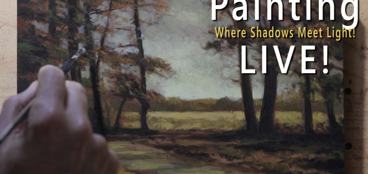
Author: ixnax

  • A Landscape Painters Guide to Modulation – Easel Talk 35

    What Is Modulation?

    I mostly mean color modulation, but also value modulation. It’s a word that’s in my head all the time as I’m painting.

    Basically, it’s moving from one hue into another. Like, you might move from a red into a purple. That would be a modulation in hue. And it can be quite subtle. You could go from a bluish purple into a slightly reddish purple. It doesn’t have to be anything massive. It’s still modulating. And it’s really important.

    The definition: also known as gradation. It is always desirable in painting to modulate colors from cool to warm, from dark to light or from one hue to the next. Instead of just laying down a flat, unmodulated color, you want to do some modulating. Always be modulating. ABM.

    Now, a flat approach can constitute a style. It might be your style. Might be awesome. Fine, good. One approach is like the mosaic sort of approach—a lot of discrete, flat patches of color that actually create interest. That’s a totally valid approach. That’s not how I work. We’re talking about a painter that modulates. And I hope it’s you after you watch this video.

    Why Modulation Matters—Everywhere and Always

    Modulation matters everywhere and always. One of the reasons the word modulation is in my head all the time while painting is because there are very few aspects of an oil painting that will not benefit from some modulation, even in big ways or little ways.

    Modulation creates visual interest, suggests atmosphere and space, and helps guide the viewer’s eye through the painting.

    Back in the early days of the computer era, when I was working in Photoshop, one of our gigs was making little illustrations of bugs—ladybugs, dragonflies, things like that. Because you had such limited colors, you always had to be doing gradations to create interest. And I think that’s one of the things that really helped me as a painter because in screen printing, which is mostly what I was working for, you always have a limited palette.

    Sometimes a maximum of eight colors for most designs. And if you could do it with four colors, the company generally would make more money too, because that’s less cost for printing. So maximizing what you’re doing always—at least with the value shift from darker to lighter. It can be very subtle, this modulation thing. And if it’s subtle, that’s fine. You want to do it. You want to always look for any opportunity you can to move things.

    The Sky Strategy

    When I’m doing the sky behind the clouds, I always modulate that background sky color. And you’ll see me do it in painting after painting. Generally I’ll do the blue sky first behind the cloud shapes. And it’s always going to be darker and usually richer, more chromatic at the top of the sky.

    Darker, richer, more chromatic. And then as we come down towards the horizon, it becomes less colorful, more chalky, because that’s the idea of the haze coming up from the ground plane, right?

    So we modulate from the deeper blue to a light, creamy ochre towards the horizon. Dancing over this basic modulation are the clouds themselves, which will also have their own kind of modulation. And clouds—the reason we see a cloud is different from the sky is because it’s usually gray and the sky is some kind of blue, right?

    You can really bring a lot of drama and interest in even the most boring sky you might be painting from. Don’t make your painting boring. We don’t want that. We don’t need it. We want your painting to be interesting.

    One of the ways you can do that is use the reference as reference. But as you create the painting, remember modulation. The clouds have a whole range from value, from darks to lights, from cools to warm. And then you can change up the hue. Suddenly it looks really interesting and attractive.

    Tree Edges and Transitions

    An especially crucial place to think of this aspect of landscape painting would be where the trees meet the sky. This is a great place to modulate the tree edges by adding a bit of sky color, bringing it in with the tree color.

    You’ve got to be careful. Sometimes this could create a chalky, muddy mess. But don’t do that. Work intelligently. If you need to, just make sure there’s less white in that mixture you’re bringing into the edges of the trees to modulate those edges.

    This gives you an area of transition. The master of this is Camille Corot. Just be thinking transition. And then be careful, because if you do it tight, you get the halo effect. And that’s the kiss of death. You don’t want that.

    But any strategy for addressing the tree edges coming in over the sky—that’s especially, I think, when you’re starting out, one of the most challenging things to master with painting: how your tree edges interact with the sky. Modulation is one of the big keys.

    Let’s visualize the tree shape. You have a range of greens. And I’m going to tell you to bring in a bunch of reds and things to create interest and variety. But generally, if you imagine this tree shape and the light hitting it on one side, that is a modulation, isn’t it, running across there.

    You’re going to want to have, on one side of the tree, it might be cool and blue. And as we move towards the light, it might go warmer and more orangey. But still in that range of greens, because green can support all those transitions.

    The Photograph Problem

    This is a place where photographs betray most painters. Most photographs will present quite a harsh edge. They tend to make things look clipped and cut out. They tend to over accentuate that contrast between the darker tree shapes and the lighter sky.

    And you, as the painter, it’s incumbent on you to soften that and make it feel more natural, because you don’t see things as a human the way photographs capture them. We have the ability to perceive a lot more light in the shadow areas and a lot more darkness in the light areas than most cameras do.

    You’re a human being making a painting for other human beings. So definitely don’t do these clipped out looking trees.

    The Ground Plane

    Because our last talk was about painting nothing—painting areas of ground that’s boring, or grass that’s boring, or a beach that’s boring. And one of the big things you can do to create interest in any boring flat area is modulate.

    Think about the modulation of the ground plane. Areas of dirt, grass, and rock need to be modulated just the same as the sky. In the case of the ground, warmer, darker colors at the bottom moving in. I always want to pull you in. So the modulation is designed to point the viewer to the subject. Usually it’ll be a group of trees or something.

    Almost everything in your painting should be subtly pointing the viewer to that. And the modulation of all the colors in the ground plane should be moving you towards that area. A lot of times it’s a dark to light thing. But the same thing applies with the ground as any other thing you’re modulating.

    You have three ways to modulate: value, hue (the actual color itself), and warmth or coolness of that color. You could go nuts with it. You could go absolutely nuts.

    If you were a graphic artist, this is something you would have definitely employed because you’re working with more simple forms. As a painter, we can do all kinds of fancy stuff with our brush strokes. But even while you’re doing all that, modulate the whole way through.

    On the ground, I’ve got a path problem. I’m a path junkie. I’m going to put a path in almost every scene and what I do—or a road or a stream, same difference from a visual standpoint. And you always see me make the modulation throughout the path from somewhat darker and more subdued colors to brighter. And quite often more saturated colors.

    You don’t have to modulate all three of those aspects. You can do. And in many cases, you should do. But you do what’s appropriate for the scene. Like in the case of a path, you’re not going to want to make it dark gray on the bottom and modulate it up to a screaming bright orange unless you’re doing some kind of crazy fauvist painting.

    The Intuitive Aspect

    Color modulation is one of those areas where intuition comes into play. I’m painting alone and the color I’m painting may or may not even be in the reference. Or it might be something triggering me. But often I’ll say, ah, I should bring in some violet here. I should bring in some red here. Or bring in whatever it is.

    That’ll pop into your mind. And you want to sensitize yourself to that inner prompting. Because the more you pay attention, the more you listen to that interior voice, the stronger it becomes. And it will help you make more dynamic and interesting paintings.

    ABM. Always be modulating. I’m always trying to create interest. And I love the word modulation. Color modulation is a big part of what I do. It’s all about responding to what’s happening on the canvas and making the necessary shifts to enhance the overall visual interest of the painting.

    Remember those letters: ABM. Write it down on your easel off to the side. Because there’s almost nothing in your painting you can’t modulate.

    Even if this makes you a little self-conscious as you’re painting, fine. Good. Get it in there. Because this information, you want this in your painterly DNA. This will make you a better painter right off the bat.

    Learning how to execute the shape of a tree and stuff, that really comes with experience. But you could be modulating right now. Right now you could improve your paintings with modulation. So ABM.

    Modulation Versus Blending

    It’s important to note that modulation is not the same thing as blending. Blending creates smooth transitions. You can smear, or you can dab, or you can do whatever. Smooth transitions between colors, which can be beautiful, but sometimes lack character.

    Modulation on the other hand is often more about purposeful shifts in color temperature, hue, and value. That can be blended or not. You can do a lot less blending if you’ve got modulation, actually, because you have more interest. All this depends on your desired effect, of course.

    Why It Matters in Tonalism

    In tonalist painting, modulation is particularly important because it helps to create the atmospheric quality that defines the style. When you start simplifying forms, you have to bring in interest. And the best way to do that is with modulation of value, hue, and the coolness or warmness of the colors.

    By shifting colors and values, you can suggest mist, atmospheric perspective. Think of it like you’ve got that ridge of hills in the middle distance. Instead of doing it flat, you can bring up some lightness from the bottom. That’s a cool trick. And that could indicate fog, or it just could indicate dust, or haze, or whatever. But that in itself would be modulating in that area from a value modulation. It could also be a color modulation.

    A Simple Exercise

    To develop your sense of modulation, try this simple exercise. Design a simple landscape with just a sky, distant hills, and a foreground. Make it simple—think of those ’80s graphics with simple mountains and some simple cloud shapes. Just make everything really simple and almost graphic and designy for this exercise.

    For each element, consciously modulate your colors. In the sky, shift from colder blues at the top to warmer, lighter blues near the horizon. For the hills, modulate from cooler, bluer tones in the distance to warmer greens as they come forward. And in the foreground, practice shifting between warmer and cooler greens and browns in the ground plane.

    You don’t really need a reference for this either. And I think you’ll see that this will look really attractive and pretty cool and definitely help you get why this is so critical.

    The Payoff

    Over time, modulation will become second nature, and you’ll find yourself instinctively creating more dynamic, atmospheric paintings that capture not just what you see but what you feel. And that’s what we want.

    That’s what you bring to the party, right? Because you’re the only person. The universe split itself into billions of little bits. And each one of us is occupied by one of those bits. And each one of us has a unique perspective that only we have and only we will ever have.

    Because you have a unique perspective on things, this is what you have to offer. This is what you bring to the party. And if you spend a little time developing it, you’ll create work that no one else could ever create. And that’s intrinsically valuable and meaningful.

    The Real Difference

    It’s the difference between a painting that looks flat and one that breathes. It’s the difference between documentation and emotion. You feel things. Feeling, that’s what you have.

    Modulation is not just a technique. It’s a way of seeing and responding and painting as you are working that acknowledges the constant shifts and changes in light, color, and atmosphere that make up our world and that make things so rich.

    And it’s everywhere. Once you start dialing into it, you’ll see it everywhere. Many times I say, oh, you put a Z in there and then start using that to help you break up the space. Well, a lot of times after you do that, you say, well, there actually was a lot more deviation in that space. And you know what, my little way of breaking it up very much resembles what was there that you weren’t seeing.

    And it’s very much the same thing with modulating. Once you’re dialed in, you’ll see it’s everywhere. And it’s real key to basically, it’s a rendering thing. It’s a painting thing. But it’s important to create interest and make your art more vital.


    Take good care. Stay out of trouble.

    And fight the power.

    Mike New Site | The Book | Gallery | YouTube | Members Area | My Music

    M Francis McCarthy, Your Painter in Residence

  • Beacon – Music by Black Wren

    Music by Black Wren

    When the night grows deep and the shadows call, sometimes all you need is a beacon to guide you home.

    Black Wren is a collaboration between Michael Francis McCarthy ( New Zealand) and Jennifer L Coward (UK)

    Buy the track on Bandcamp:

  • The Modern Creator Dilemma: Why I’m the Anti-Influencer

    Today’s talk is about the modern creator dilemma, mostly on YouTube, but this applies to any platform.

    How the Machine Turns Us Into Machines

    The biggest problem with the current setup is that the corporate machine is turning human beings into machines.

    Let’s say you want to express yourself and start a channel about two or three different things. You’ll find rapidly that the algorithm doesn’t want that. It wants to put you in a niche and promote you as that niche. That’s fair, in a sense. People search for specific information and the algorithm serves it up. There’s no shortage of choice or videos to watch.

    The algorithm isn’t evil. It’s trying to help people find what they want.

    But the end result is that you may have started out expressing one thing and ended up becoming someone you never envisioned.

    The Boat Painter Analogy

    Let me give you an example I use with my students.

    You’re a painter who likes landscapes, trees, ponds, paths. One day you think, maybe I’ll paint a boat. It comes out okay. You put it in your studio gallery and decide, “I don’t care about this, I’ll just put $5,000 on it,” even though you don’t normally sell work for that price.

    Next day someone walks in. “I’ll have that. I love boats.” $5,000, no problem.

    What are you going to do? You’ve got bills. You like money. So you paint another boat. And guess what? That sells too. “Now they like boats. Better paint more boats.”

    Five years later, you’re in Boat Painter magazine. They interview you: “You must really love painting boats, huh?” You say, “Oh yeah, yeah, I love them.”

    But you wanted to paint landscapes. You ended up painting boats because that’s what the market rewarded you for. You’re now the boat painter. You didn’t set out to be that, but there you are.

    The same thing happens on YouTube all the time. You do one video and it goes viral. It’s natural to think, “They like that.” That was genuinely me communicating. So you do more of that, and eventually you end up in a place you didn’t want to be.

    That’s how the corporate machine turns us into machines.

    How You Start May Not Be How You Finish

    Unless you’re careful.

    On my painting channel, I’ve endeavored to do that. After 10 years, I’ve got 6,000 subscribers. Look around at oil painting on YouTube and you’ll see that’s not huge numbers. My channel could have been way bigger. I felt the pull. I could see what did well.

    I acknowledge that. If it’s within the parameters of what I want to do, I do it. But I often put up paintings I know the channel doesn’t like because I know the trap. And I don’t want to fall into it.

    This channel is a response to all of that. This is the anti-algorithm channel and I am the anti-influencer.

    Why AI Changes Everything

    Why is it good to be an anti-influencer coming up? Two letters: AI.

    AI can create all the specific content you want. You ask it to do something and it does it. It scrapes information and brings disparate things together, often in creative ways. It doesn’t care what it creates. It just does what you ask.

    I’ve clicked on promising YouTube content and gotten AI voices. I could tell right off it’s AI, so I click away. This isn’t a real person’s point of view.

    I can tell now, but will I be able to in two, three, four or five years? A lot of people will be content to consume AI content and they will. YouTube is becoming TV, and TV is becoming AI.

    What does this do to all the people who sold their soul to be an influencer?

    Here’s the thing. Five years ago, I made decent money on YouTube, enough to buy pizzas and help pay my studio rent. But last year that changed. I don’t think YouTube doesn’t like me. They want me creating content. That’s what they do.

    As a human being it’s incumbent on me to decide what I’m going to do and why and for how much.

    I had to make a decision. If you were watching carefully, you’d have noticed a falter. I almost decided I don’t need this anymore. But I remembered why I started in the first place, to share what I do. YouTube allows me to do that, so I’m doing it anyway. Except, now I do it because I like it, not because I’m getting paid.

    AI is coming. It’s already here. It’s going to have a huge impact on the influencer economy.

    No More Reason to Pander

    Because of AI, there’s no reason to pander anymore, unless you didn’t have a soul in the first place.

    I’m old. I’m not ancient, but I’m not young. I remember a different time when media was limited. There were only so many magazines, radio stations, record stores and artists that record labels would sign. These people became celebrities, rock stars, famous.

    Even younger generations are aware of this. For my generation, when you create something awesome, you expect the world will acknowledge it.

    The Miracle We Take for Granted

    What’s remarkable now is that I can record a video, upload it to YouTube, and one person or a million people could watch it. That’s never happened before in human history. It’s a miracle.

    We should acknowledge and respect that, not take it for granted. I point this out to people on my painting channel: you can see a whole painting come together stroke by stroke. I would have loved that when I was young.

    This channel isn’t scripted. People polish their scripts and make wonderful content. I’m not criticizing that. But we have a malaise, a bit of a cancer. I’m trying to address it. It’s time to be a human being expressing themselves, and that’s worthwhile whether one person or one million people are paying attention.

    Express Something That Matters

    It’s important now that we have this ability to express ourselves and communicate with people all over the world that you care about what you’re expressing. It should be something worthwhile, something that means something to you.

    You shouldn’t do it for surface reasons or to make money. If you are doing that, I’m not here to judge.

    I’m talking to people like me.

    One Person or One Million

    I put up one of my songs and got two comments from one person. That song affected them. That gets back to my one person or one million modality.

    The fact that one person was moved by my song, moved enough to comment, means I’ve succeeded.

    Will it change me dramatically if a million more do? It may get me money or inflate my ego. But not really because I’ve created something I think is great, something that stands up with anything anyone else has ever done musically. I can’t help but want more attention for my music.

    Is it going to happen? Probably not. And that’s probably not a bad thing, because if you get one million views, it’s natural to want two million, three million, four million.

    Where does it end?

    The Future is Personal AI Content

    AI is coming. Everyone’s going to be making their own AI thing. “AI, make me a classic Star Trek episode,” and it will. It won’t be bad. Probably pretty good. But this will also be just an internal loop.

    Now’s the time to put your real stuff out there. Think about what’s in you that you need to express and express it. If it only gets to one or two people, great. Move on to the next thing and keep expressing.

    The Universe Invested in You

    This is how I think reality works. The universe split itself into seven billion individualized units and invested itself in each one. It has a plan. Maybe it’s evolution of consciousness. Maybe it’s everything becoming love again. I don’t know.

    But here we are.

    I don’t think the universe wants to drive your life or steer it. That’s incumbent on you. You decide what direction you want to go and how far and fast.

    I believe that if you’re doing the right thing you’ll get some support. It might be a good feeling. It might not be a paycheck or hundreds or thousands or millions of people acknowledging you. That’s something we all have to face.

    This Channel Reflects That

    This is the anti-algorithm channel. We’re going to have a talk one day, a song the next, a painting after that, some photography. Why not? I’m just going to express myself.

    The algorithm won’t like that variety. It won’t make me famous.

    Maybe this talk will get views because I’ve seen a lot of this ‘content creator blues’ stuff in my feed. Creators saying, “I used to make money, I used to get views and now it’s half. I can’t afford to live anywhere! I’ve got to get a real job.”

    It’s tough.

    Legacy and Why I Paint

    Not everyone cares about legacy. I do. Maybe that’s vanity, but if you create something worthwhile, you’ve got to believe someone will care someday.

    That’s why I put most of my energy into painting. Unlike music, if you don’t have the electronic means to play a song, it’s meaningless. But with a painting, yes, you can photograph it and make copies. But if the means isn’t there, you’ll always have the painting.

    Someone will value it if it’s beautiful.

    The Shaman at the Edge of the Village

    This is the anti-algorithm channel and I am the anti-influencer.

    Not far back in human history, I would have been living in a hut at the edge of the village, aware of what’s going on but not quite part of it.

    This was valuable because people would come to me like they go to the medicine man or the wise man, seeking advice from somebody who understands the community but has the ability to see outside of it.

    That is who and what I am. That’s one of many things I am and it’s being expressed here. Will it be valuable to some people? I think it will. I can’t be attached to that though.

    I hope you check out my music and look at my paintings when I start showing them here. But you may not and I can’t really care too much.

    Your Job as a Creator

    The last thing I want to say: I believe our creator has invested us with the ability to create. This message is for those of you who do want to create.

    If you do, you should create something meaningful, something beautiful, something people will care about.

    However, once you do that job, your job is essentially done. Put it out there. You owe it to your work. And if you get one comment, one acknowledgement, that’s as good as one million.

    Create like your life depends on it.

    Create, create, create. Get better and better at it.

    That’s my message for you today. Take care of yourself, your family, all your loved ones, and stay out of trouble.

    Michael Francis McCarthy

    The Anti-Influencer

  • When Everyone’s a Stranger- Music by Abyssm

    “When Everyone’s a Stranger” was written late last year, a reflection on individuality, solitude, and the strangeness that can descend when memory fades…

    All music written and performed by Michael Francis McCarthy (Northland, New Zealand). No AI used.

    This channel holds music, films, photography, and spoken reflections.

    Buy this track (Bandcamp):

    More music (Abyssm / Bandcamp):
    https://abyssm.bandcamp.com/

    Lyrics

    It’s no use crying
    The story ends the same
    Some of us remember
    Who’s to blame
    Nothing seems to change
    The suffering and shame
    As the story goes
    With nowhere left to go

    We’re gone…

    When everyone’s a stranger
    Watch out for desire
    We had a taste of love
    But it was just for fun
    Lost in thought
    These moonlit days
    Trying but forgot
    How’d to get away

    No one else remembers
    So I keep the flame
    When everyone’s a stranger
    Then everyone’s the same

    The stars who wrote this song
    Well they got it wrong
    They weren’t here very long
    And now they’re gone

    When everyone’s a stranger
    Watch out for desire
    We had a taste of love
    But it was just for fun
    same old sing song
    It’s all long gone
    Nothing here belongs
    At all

  • Dusk’s Ember – 15 Minute Painting Demonstration!

    A Fauvist coastal sky scene

    The painting I’m bringing you today is called Dusk’s Ember. It’s a 7×14 and I painted it day before yesterday. I was anxious to share it with you.

    Maybe some of you noticed that I didn’t say welcome to another tonal landscape oil painting demonstration. I don’t think we can call this painting tonal. Yes, I use many of my Tonalist tricks in here, but it’s more like modern fauvism or something. Pretty saturated, the color. First of all.

    The Origin Story

    I did a smaller iteration of this scene. 5×10. Different composition, different color work. But it didn’t record properly. Camera wasn’t focused. Had to ditch that. Which was fine because I had some things not really worked out, like the color in the water.

    So the next day I set about recomposing the reference image. Got it all together and proceeded to make this painting. The interesting thing: the original was 5×10. This is 7×14. It took the same amount of time.

    I’m really happy with the way this painting turned out. One of the reasons I was anxious to share it with you today. It’s got a really cool, dynamic, beautiful feeling to it.

    The Underpainting Problem

    We’re doing the underpainting right now. That painting I did the day before, I was trying to work on gray and it kind of worked. But I had an issue where the gray board was peeking around in ways that just weren’t that good. So I’m leaving that painting alone. I’ll probably sell it or something. Not a problem.

    But it’s really showing me that the gray is good for bluish type scenes and pretty much that alone. So we went back to our rich soil color here.

    The black tone that we mixed for the underpainting: normally I would do Mars black and a little bit of burnt umber. But here I used Mars black, a little bit of burnt sienna, a little bit of rose matter, and actually I think I even slipped in a little bit of dioxazine purple as well.

    In that smaller version I thought, oh I’ll just use ivory black. And I ran into all those issues I get with ivory black when I’m using it for darks: streaking, transparency. I’m making brush strokes and the color of the board is coming right through. This is one of the reasons why I think Mars black is superior for that sort of job. That’s what I used on this one and I’m really glad I did.

    Blue and Orange: The Color Challenge

    Part of the brief on this painting was I wanted to do blue and orange. Some of the people who saw the first iteration were like, “Wow, that’s dark.”

    I didn’t feel it was. In fact I felt it was light. I get that sometimes in my studio. A lot of people come in and say “Why is everything so dark?” And some people come in and say “Look at the light.”

    That is the point. You can’t have light without darkness. The two go hand in hand. I am very much into the extreme contrast. It’s pretty extreme in this case, not just from the standpoint of value contrast but also and most importantly from the contrast of hue. The orange is the opposite of blue on the color wheel. So in many ways this is a complementary color scheme.

    I don’t know how nature pulls it off. When we’re looking at one of these glorious sunsets or sunrises, how is one cloud being picked out for one color and another cloud for another? It might be good to research. On the other hand I don’t actually mind having that be mysterious. I use a lot of artistic license.

    The Transition Problem

    If you try to move from blue into orange, if you’ve ever tried it, you get a real problem right away. When you start putting orange paint mixed with the blue you get the ugliest gray. Maybe it’s not that ugly but it’s not desirable.

    So what you see me put in was a whole transitionary bunch of color. My go-to there was purple into red. Purple, red, orange gets on great. Even purple and orange get on real well. There’s enough red in the dioxazine. And dioxazine was the purple tone that I leaned on quite a lot here.

    And dioxazine is not a mixable color. Any one of you that disagrees, welcome to tell me in the comments. That would make you the third person that ever disagreed with me on that. Then I’ll keep using my dioxazine to get the kind of results that I get. There’s a reason it’s on my palette because it’s a problem solver. It’s a color you can’t mix and it’s beautiful.

    It’s also fake as hell. I mean if you add a little bit of white to that dioxazine you can see it looks like when we were kids and we had the Crayola crayons. That purple you get there is very much like a dioxazine. It’s not like a super reddish purple. But it’s very flexible. Easy to red it up using the matter or I also leaned a little bit into the Cadmium red here. I used quite a lot of the Cadmium red hue, which in the live sessions you often hear me referring to as my mixing red.

    Because it has a lot of purposes. One is to give me a range of different oranges. Two, I can throw it into the green tones and get a good result. Most importantly I can put it into colors like some of my sky mixes that might be overly green and I can use it to adjust that.

    Working with Fake-Looking References

    Now here’s a real challenge. I loaded this up to one of my assistants, my composited reference, and it was obviously accessing some of these old laser postcards where everything looked fake as hell. All the waves were like this purple tone and everything looked a bit fake but it was definitely inspiring.

    You can see in the live session how I took that inspiration and turned it into something that was still a bit different looking. Not 100% realistic maybe, but not gaudy or garish.

    That’s the thing. A lot of times that reference image, it’s fine if it’s really gaudy. It’s fine if it’s screaming with color because what it’s designed to do is to inspire you as you paint. But you really don’t want to be putting colors on your painting that are straight from the tube or too bright, too saturated. You almost always want to make them feel a little more natural.

    Reconciling Blue and Orange in the Water

    One of the things I found: how do you reconcile these blue areas in the water with the orange? And I think I did a good job.

    What we’re doing is laying down a more subtle, subdued version of the colors that would be coming over the top. That’s a great tip for you. You know you are going to get those bright colors in there. We don’t want to paint everything bright. What you want to do is have more subtle and subdued versions of these colors that are carrying a lot of the weight, then you just put some strokes.

    I laid down kind of this more muddyish, reddy, orangey tone and now we’re coming over with a more saturated bright orange. And it worked really well throughout the water. I wasn’t sure it was going to work but I was okay with it. I do think it’s a saleable painting. I’d be interested to see what the market out here in New Zealand thinks of it whenever I get it into a gallery.

    The Sky Series Returns

    If you’ve been with me a while you know the Sky Series. This is a Sky Series type painting. It’s probably been about two, three years since I got into doing those and then things tend to go in cycles with me. When I go back in the studio on Monday that’s what I want to do. I want to do some more skies.

    I keep a folder full of skies I’ve collected for the last 15 years that I generally will composite into my reference using Photoshop skills. These days if you’ve got Photoshop it will do the sky replacement very easily. There are other tools too.

    Many of the skies I’ve collected are just over the top. You couldn’t really put them in a strong landscape scene because they’d be too dominant, too bright, too intense. When I was collecting reference, I stuck them in the folder because they caught my eye and I thought they had some artistic merit or potential. Many of those would be the genesis of a Sky Series painting because it’s all about the sky. The sky is the subject. So it’s okay if it’s crazy like this. Yellow, white, blue, boom, right.

    Building the Water

    That water is working really well. I had one of my fellow artists come in and say “Wow, that is working really well” and I totally agree with her. You can see how I had that sort of middley kind of tone down and just brought it in a little lighter. That’s a great technique for you guys to remember, and one I’ve been pointing out on the channel for years.

    Don’t try and do everything all at once. It doesn’t mean you need to take all day either. This painting session took a couple hours, maybe a little longer, and we’ve got a beautiful painting.


    Take good care of yourself, your family, all your loved ones. Stay out of trouble and fight the power.

    Substack Studio Pass | The Book | Gallery | Supplies Page | YouTube | Members Area

    M Francis McCarthy, Your Painter in Residence

  • Dusk’s Ember – Full Live Painting Session!

    Live Painting Transcript and Key Insights

    We did a version of this yesterday on the gray. Perfectly saleable. Smaller. But I’ve changed the scene quite a bit with some help from my assistants. You’ll see some synthetic color mixing here. Grist for the mill. That’s how we roll.

    One of the main issues I struggled with yesterday was transparency in the ivory black. I thought, “I don’t need the Mars black.” The painting’s quite nice, I’m not complaining. But the underpainting color—it’s not so much brown as black with brown—and when it’s that dark, the ivory black just doesn’t give you the coverage you need. It streaks. It shows through where you don’t want it showing through.

    Dusks Ember 7×14

    Yesterday I had gray peeking around the peninsulas, between the rock shapes and the orange. That gray was too light. It called attention to itself. Problem. So today we’re switching to Mars black. Mars black is more opaque. It dries. It gives you coverage without the transparency issues.

    I showed a friend of mine yesterday’s painting. I’m quite proud of it. Beautiful stormy blue sky with a golden horizon. He said, “That’s ominous.” My assistant called it “apocalyptic.” I wasn’t thinking apocalyptic, but I guess it is. The painting works either way.

    The Underpainting

    It’s 10:30 Wednesday, March 18th.

    The underpainting color is not pure brown. It’s black with brown. A little matter in there, maybe verging on purple. When the color’s this dark, you can sense it. It’ll look even better on the painting.

    I’m pretty happy with where this is at. The underpainting will support everything that comes after.

    Here’s the thing about the reference: you’ve got these silvery little peninsulas, rock formations, and there’s detail I’m going to completely ignore. I want them mostly dark. I don’t want a lot of focus on these. They could become a whole subject on their own. Don’t want that.

    Always be closing, my friends. Always be closing. That means we’re always thinking about this hanging in someone’s home. Don’t get immobilized by the reference. There’s detail I could get involved with. Not going there.

    One thing about yesterday’s painting that doesn’t work as well: I made the whole ocean bit just orange. But there are going to be waves here. There’s going to be activity. There’s going to be color variation. That’s more interesting.

    Understanding Yesterday’s Failure

    Yesterday’s was a five by ten. It looked cool, but there was a few issues, some palces where I failed

    The thing about failures is: your successes are built on your failures. You have to understand that. The streaking issue with the gray, the problems with coverage, those are lessons. Next time, I know to use Mars black for the underpainting. I know to close up the composition. That’s how you get better.

    Color Mixing

    Thursday, March 19th. The underpainting is bone dry.

    We’re in color mixing mode. We need a lot of blue. We’re going to take at least half of this and make it a lighter blue. Now we’re breaking out the Cadmium. Cad will be a player here.

    What’s on the palette: titanium white, titanium buff, Cadmium yellow, yellow ochre, Mars yellow, raw umber, Mike’s green, Cadmium orange, Cadmium red, burnt sienna, rose matter, burnt umber, perylene black, permanent green light, dioxazine purple, Persian blue.

    I’ve got a fairly synthetic reference. It’s based on manipulated coastal scenes from postcards. Those images tend to look synthetic—where the waves are tinted violet because the photographer had a filter on the camera. You don’t want it to be too fake or false looking. But you can use that synthetic quality as a starting point and make it your own.

    Here’s a big lesson I learned yesterday with the ivory black: it’s great for mixing because it’s clean. But for doing a dark underpainting, Mars black is superior. It’s darker, it dries, and it gives you coverage in areas where maybe you want things dark without all that streaking and transparency.

    I don’t want to mix every color here. You want some colors to emerge organically as you paint. But we’re going to establish these transition colors now because we’re going from blue into orange. That’s a big jump. You’ve got to have a cushion. A color that gets on with both.

    Painting the Sky

    I’m starting with the sky in red. I’m tempted to not mix very much paint, to go very dark. But we’re going to build it.

    I kind of like doing this sort of move, gets you out of brush stroke mode. I don’t mind some of that brown peeking through. It’s nice. The gray was too light, called attention to itself. So here we’re going to start modulating.

    You don’t even have to use dioxazine. You can frankly just use matter and Persian blue together to make all kinds of neat purples. If you don’t have matter, crimson’s fine. Same difference. I like matter because it’s a little cleaner.

    There’s the dark foundation. Now we’ve got this kind of sky blue element. You would think that’s going to make it purple, but just barely really. It just counteracts that greenishness.

    You saw the reference. I don’t want it just in the center. Could go a little brighter. Pure, more bright. When you give yourself a foundation like this, you have something to build on. Whereas if you just go in pure color all the way, this is still not exactly pure, but it’s getting there.

    A little more grayish purpley. I’m trying to avoid creating stripes. I’m going to grab some more pure blue. The black brings out the green aspects. That’s okay. I just want to make this a little more smoky.

    It’s time to transition. I really want to lean into the burnt sienna. But burnt sienna is missing opacity. I’m going to keep helping it with the Cad red because it’s time to transition.

    Remember this is our transition color. This is how we get in. The challenge is we’re going from blue into orange. You’ve got to have a bit of a cushion. A color that gets on with both.

    That’s kind of the color I’ve been envisioning. You could almost say, “Mike, why didn’t you mix that?” Well, you don’t want to mix every color. You kind of just do the broad bits.

    I’ve got some bunchy up bits. I don’t want that too much. I want some bunchy up bits. Don’t get me wrong.

    You don’t want to be in a hurry. In your reference you’re going to have a lot of complexity. Don’t get hung up on that. Don’t worry about that. Worry about what’s happening in your painting.

    Richard Schmidt, he’s got like four yellows. I can see why. We don’t have four yellows. We got this one. That’s pretty good. That’s giving me what I want.

    It takes a little while for you to get to know your brush. I can feel how much paint I have. A lot of times you see me make a move and nothing’s happening. I turn the brush over and then something happens because I know, I have a feeling for how much paint’s in there. That’s going to be based on experience with your brush.

    I don’t have a problem but we can fix it. We’ll fix it with purple. Purple is going to be our problem solver here.

    One thing I don’t like is suns in my stuff. You never see me do that ever. I’ll do something like that instead. Create an atmospheric glow rather than a defined sun.

    The Rocks and Beach

    Let’s not get too carried away. I think we’re looking really good. Now all we got to do is some waves. Oh, rocks. Let’s do the rocks next.

    You can see the difference between adding the ivory black versus the Mars black. Mars black is like, “Yep, you want this dark? No problem.”

    What I’m doing here is instead of drafting, I’m just using the brush to vary things. Giving us the feeling of rocks, ideally. We’re avoiding lots of draftsmanship on these rocks.

    We have a beach. It’s gonna be just barely above the rabbet of the frame. One thing that’s great about this composition is I can do the light in the center, everything fading out. I warn you usually not to do that for most of your landscapes. But it’s fine here. I’ve done it and I’ve sold those paintings.

    The Water

    I’m kind of running out of room here. Which is okay. As soon as those waves are in, we’re done. We don’t want to sit here and fuss.

    This color is a nothing color. I’m painting water with purples, blues, teals. That’s counterintuitive. It just gives us the feeling of motion.

    I’m wiping off that brush. Make sure there’s nothing in it. We do want some little places where paint bunches up, but not everywhere.

    Alright, we’re done.

    Technical Materials

    Reference

    Take good care of yourself, your family, all your loved ones. Stay out of trouble and fight the power.

    Substack Studio Pass | The Book | Gallery | Supplies Page | YouTube | Members Area

    M Francis McCarthy, Your Painter in Residence

  • Welcome to Michael Francis McCarthy

    This is the introductory post & video for my new channel and website.

    Here I’ll share music, thoughts on philosophy, AI, creativity, and whatever’s going on. No niche, or algorithm-chasing. This page is a window into what I’m making and thinking.

    Warts and all.

    Contact: mike@mfrancismccarthy.art