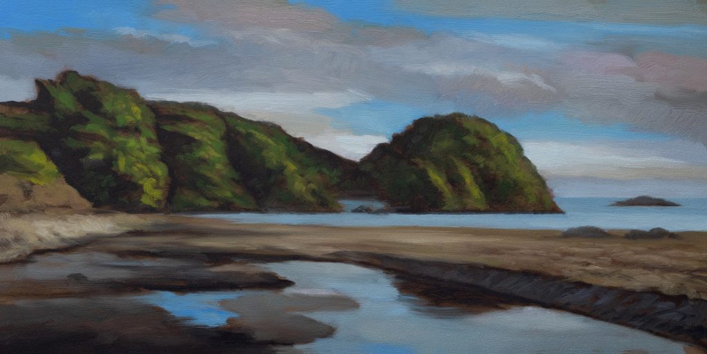
Matapouri Bay at Dawn 5×10 – 15 Minute Painting Session!
You don’t need a bunch of different blues. You only need one blue, use your favorite. I like either phthalo blue or prussian blue. What I love about prussian blue is the history of it. It’s the first synthetic pigment made available to people. Prior to prussian blue, the only blues available were extremely expensive, like lapis lazuli, which is a semi-precious stone. Artists would often charge one amount for the painting and then an extra amount if the client wanted blue in there. The workaround? Ivory black mixed with white gives you a very cool gray, which in many applications can definitely read as blue.
Start with that blue, get yourself some white, and I always recommend adulterating it somewhat. I like to adulterate with raw umber and/or ivory black depending on the application. The raw umber will tend to green it up, not with every blue pigment, but definitely prussian blue has these latent green tendencies which raw umber really brings up.
The Real Key to Sky
The real key to making blue sky and gray clouds interesting is playing off the warm grays against the cooler grays. I’ll always mix both and use both, even if the reference is only showing me cool grays or only showing me warm grays. I’ll play them off each other.
Another great technique is to tint things. You can go a little bit more burnt sienna on the uppermost cloud pattern, or I might go into pinks or I might go into purples. With the cool grays, there’s all kinds of ways to expand things and add interest. You should definitely be looking for opportunities.
In your lightest areas, I’ll mix a light color, usually some type of cream. That’s usually some yellow ochre, always some yellow ochre, actually, a bit of raw umber, a bit of maybe even mixed gray to adulterate things, and then titanium white or titanium buff depending on what I’m trying to do. You never want to go with the brightest tube white.
The Underpainting
The underpainting is so critical because it’s where you figure things out. It’s where you get the architecture. It’s basically like the blueprint for the painting. A lot of times I might go fairly dark on the values there, but I always go darker when I move into the color portion.
What I like about this painting is that it has a kind of crisp feel. Look at that round mass at the end there, it’s generally a bit larger than the other mass. I kind of tweaked the perspective a little bit because it bothered me. I figured it’s just a matter of perspective. I was real happy with the way the greens came out. It looks quite lush and rich, and that’s predominantly down to my favorite green, which is Mike’s green.
Mike’s Green
Mike’s green is ivory black mixed with a krill-eyed yellow, that’s PY 73 or PY 74. You can get that as a brand name from Gamblin, Hansa yellow, or you’ll see it in a lot of cadmium yellow hue pigments like from Winton or Georgian or Classical when they have their cadmium hue. It’s not real cadmium because if it was, it would be quite expensive.
I like that over cadmium for that job because cadmium is so dense and opaque, it brings in kind of a chalky feel into those greens, and I don’t like that. The hansa yellow is light fast in mixtures. I don’t use it as a glaze anyway. If I was going to glaze something yellow, I’d use transparent earth yellow from Gamblin, or I use Indian yellow, or I like to use a mix of both.
Compositing the Sky
This is based on a photo I took. I went out there very early one morning at dawn. The sky was clear that day, and I’m not the kind of guy that’s just gonna paint you a plain blue sky. That’s just not me. So I dropped in another sky, composited in another sky. But what I loved about it was the reflection of the sky and the landforms into the water that’s on the beach. Of course, that’s just some water left from the high tide.
I was out there at fairly low tide, which I think is better for beach photography because it just shows more of the land masses. I’m not the kind of guy that’s gonna sit there and just paint some waves on the beach. I’m more interested in the coastal landforms. I’m very much a landscape painter, not a wave painter. I wouldn’t even consider myself a seascape painter, a coastal painter.
Simplification and Design
I did a real nice job with this scene, and I really love painting things like sand. There was a decision made here not to bring up too much of a wave thing. I thought just a bit of a slash of that light blue color would do the job. You always want to design and simplify your painting in whatever ways you can. The goal is to add interest and value to the painting, make it a good experience for the viewer.
When you do that, you’ll have paintings sold. You’ll have people happy to exhibit your work in their homes. At the end of the day, I think that’s what we all want as painters. We want our work to be beautifying someone’s home. And if you can make a little money selling the painting too, that’s a gladness.
Take good care of yourself. Stay out of trouble. And fight the power.
Mike’s New Site | Substack | Painting Website | Mailing List | Store | My Music | Support | Members Area
M Francis McCarthy, Your Painter in Residence