The Waiting River 4×6 – Live Painting Session!
Transcript and Key Insights
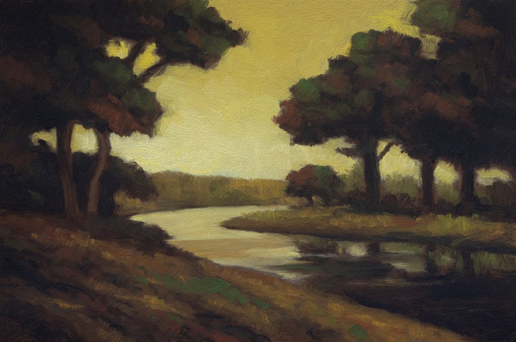
The reference image came from a multi-step process using modern tools. I used AI image generation to help compose what would otherwise just be an empty field that doesn’t work visually on its own. I cut out a section and asked for a country road, and the AI did a better job than Photoshop ever could at bringing in a bend of river rather than having it all closed off.
There are trees on the distant shore reflected exactly in the water. The way to make that work is watching out for intervals. What’s helpful is starting with masses rather than getting lost in detail. I’m looking for big masses and opening up the sky a bit more because the reference has quite a tonal feeling to it.
Color Mixing Foundation – Sky, Grays, and Whites
I’m going to need raw umber as a base because you always need it, it’s such a subtle part of the whole operation. You have to look at how fake that color is and pull straight in with a little bit of raw umber. That’s what raw umber is good for when we want darker bits of sky that don’t use red but orange instead.
For the lighter portions, I moved to pure white mixed with yellow ochre and put a tiny bit of cadmium in there. The sky at the bottom will have some nice highlights in the water that’s going to be beautiful. For opacity in burnt sienna work, bring in mars yellow for opacity and burnt umber to darken it. You can add just a little kiss of more red if you want extra opacity, just knocking it back a bit with complementary color theory using mike’s green.
Painting the Sky – Breaking Up the Tone
Starting with the sky, I applied my color without going too dark initially. That was the right call. The good general rule is when you bring in white, you bring in another color, even if you’re headed for lighter. It could be a multi-step process and that’s what keeps things interesting.
The sky has a yellow cast with no clouds, that’s not my thing, but it creates a tonal feeling through the reddish sort of cast overall. One technique is critical: you don’t want your highlights following cloud shape exactly because that creates the halo effect. You want some chunks and irregularity instead. I used a corner of a relatively new flat brush to make moves that a filbert just can’t manage.
The Darks and Underpainting Approach
Because I held off on any real darks in my underpainting, it’s going to have a nice impact when they finally come in. That’s been a little bit of a change for me, a lot of times I just like to get the darks almost as dark as they’re gonna be right away because I feel like that saves time. But everything you do affects everything else in the spirit of the painting, so patience pays off.
For the actual dark application, we’ll use this drawing brush. Even though ivory black is darker, mars black can work out to be darker because it’s more opaque. That can definitely create a toneless deal when applied flat. The key to making this work will just have a few horizontal bits going rather than closed-in feeling from the reference being too restrictive.
Grasses, Ground Colors, and Texture
The grasses are gonna be more brownish with some of that red mixed in there. It’s like having a very simple tonal feeling throughout the whole piece. For distance land, which will be brighter than foreground elements, I’ll see what it does to create separation.
Here’s where that red foundation matters in layering approach: paint some of the red-weeds first, then come in with grass colors over top. That way when you add lighter greens later, you get bits of red peeking through underneath, which is exactly what creates visual interest without being too uniform or boring.
Final Details and Finishing Touches
I came back from lunch to continue working on the one-two-three composition elements. I think the key to making this work will just have a few horizontal bits going that read okay. When you keep messing with things, you mess them up, that’s just facts. You can argue with me, but you can’t argue with facts. The best way is to put down your strokes and leave them. Move on to a different part of the painting.
When you come back later, you see opportunities you didn’t see before. For trees’ dark tones, I used strong blacks carefully, I didn’t let them go too high. Those sky holes? I replaced them with highlights rather than leaving them empty because that works better visually. By the end, when you find yourself hunting around for colors that are already gone, that’s a pretty good clue you’re done.
Take good care of yourself. Stay out of trouble. And fight the power.
Mike’s New Site | Substack | Painting Website | Mailing List | Store | My Music | Support | Members Area
M Francis McCarthy, Your Painter in Residence