Woodland Passage 6×8 – Live Painting Session!
Transcript and Key Insights
It’s your painter in residence, Michael Francis McCarthy. Today I think I’m a little ahead of schedule because instead of scrolling through Reddit this morning, I decided to go through my mounds of reference material. I didn’t know exactly what I wanted yet, so I went for it and came up with a forest scene. While digging through my photos, one jumped out.
A lot of times, my little reference additions here at the studio get me going late, but this setup is good enough. I want to make a green painting while keeping the light warmer than my photo manipulations allowed.
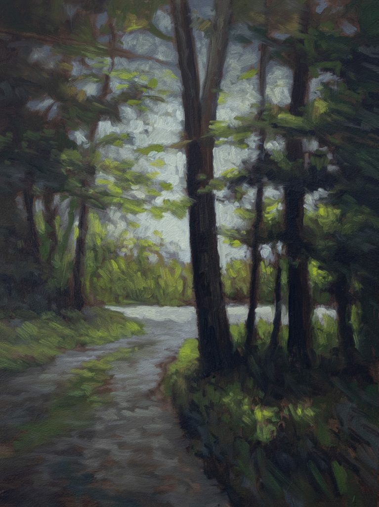
The reference has some issues: there’s just plain sky at the top which I don’t usually like, and the tree placement is a bit tricky. But I think it’ll work because we’ve got one strong tree splitting off into a branch, and a real strong light down here on the road that will pull the eye up against the contrast of the dark tree.
I’ve got my trusty “stubby” brush, a worn-out number two that’s still springy. As long as your brush isn’t stiff, it works. If a brush is stiff, it’s like painting with a stick. We’re ready for the grid. I actually changed the canvas size from five by seven to six by eight because I didn’t want to paint something too small.
Underpainting & Drawing
Let’s get this drawing done. Yesterday I was working on a very sexy nude figure, but today we’re focused on these woods. I’ve moved the trunk slightly to give it a lean; I don’t want the whole tree to lean, but the slight offset dark trunks create that contrast I’m attracted to.
As you can see, this tree just peters out around here (below). You can’t really have trees that peter out; if the reference shows it doing that, you have to fix it in the painting. If we paint half a tree people will say, “Oh, that’s cool,” but secretly they might think, “What a fool.”
There’s not much back here, just some light and movement. I’m finding that underpainting is critical because it allows us to work out the masses before diving into color. You don’t have to define everything based on the reference; in fact, defining too much early on can ruin your painting later. We’ll work with tones and shapes first.
Now let’s get rid of this grid overlay. We need that simplified mass approach. I’m looking for areas where there is no definition, working with just tones and shapes is the challenge here.
Color Mixing Session
Okay, reference check: it’s mostly green, but I don’t want it to look like “the green scene only.” That’s why I’ve put so much red in the underpainting; it will support all that green coming later. I also love the tone of the sky here, though I don’t want to go full gold or green.
Let’s mix the sky first. I have Mars Yellows here. We need a neutral gray, not overly warm. Mixing Mars Yellow with gray can push it too far into orange, so I’ll compensate with some raw umber to keep it neutral. I don’t need to mix infinite whites either.
For my darkest darks, I’m adding plain Mars Black. It has a little color in there already, which is fine, but that’s going to be our deepest value.
Now for the greens. We are going to use an alternating green-red strategy. I haven’t done this consciously often enough, but today we will. There’s a lot of dark green in this scene, so I need plenty on my palette. I’ll bring in some Burnt Sienna to warm up the mixes and prevent them from looking too cool or “electric.”
For the reds, I’m making an earthy red mix using burnt sienna, not a bright reddy-red. I might splash dots of that later, but for this scene, earth tones are key. If you’ve watched my last talk, you know we want to avoid color questions like “Is that supposed to be there?”
Let’s mix the lightest greens. These need to be coolish but not icy. I’ll use Cadmium Yellow and Permanent Green. We’re meeting up over here with a lighter color that’s grayed out but bright, basically a plan of cool grays and warm highlights.
For the road behind, we want something very cool and light. I’ll probably mix that same sort of thing as the sky: titanium white buff with a bit of raw umber and maybe a touch of Mars Yellow to get that specific gray-lightness.
Finally, a couple of colors for the foreground road. Starting with a neutral gray based on Mikes Gray and Raw Umber, then warming it up slightly with a touch of Ivory Black if needed. I want a color where red is floating in it, green is floating in it, it’s got latitude. It doesn’t have to be perfect right now.
Alright, palette cleanup complete. Let’s go paint.
Full Painting Session
Hello! Back from lunch. Got my brushes selected. For the sky, I want a flat number two; this worn-out three might come in handy for something later. We’re going to start with the darks and work our way up.
I’m finding the corner of this flat brush just right for what I’m doing now. I’m lightly getting some of those bunchy bits, discernible strokes, rather than just making a big bunch of mud. We can add highlights later.
The Sky
Let’s put in the sky color first. It’s quite a bit cooler than the reference, which is exactly what I want right now. If I need to, I can always come in with lighter colors and warmer tones over the top later. A good general rule: you can’t have anything brighter than your sky.
The Darks (Foliage & Tree Trunk)
Now we paint the darkness. We are going to focus the darkest dark right in here. As it goes up, it gets lighter; as it goes down, it gets lighter, except for that specific patch which needs to remain darker.
I could keep using the stubby, but I think I’ll have better success with a bit more flexibility. This Silver Grand Prix number one is pricey, but when you want control, it works well.
We’ll keep using the same black, just thinned a bit and applied sparingly. The painting is coming together nicely now. I found this reference years ago; it’s not special except for the light, which is what attracts me to it.
Adding Color
Ready to come in with some color. We’ll use that nice filbert, a long hog bristle filbert. The super-long ones have their uses, but this length is optimal right here.
Notice I put a little Burnt Sienna in the mix for the further back section? It’s not that far back, but I want it warmer. Things get cooler as they get darker because we are in the shadows. But, I’ve never been one for all those rigid rules. In general, I’m going to want to change things up for the ground. Same basic color, but a lot more Burnt Sienna in there. I might do a little Mike’s Gray real soon so I don’t forget it.
That’s right, I just snuck some blue in there because what I want is a cool… nice gray.
The Red Accent
Now remember how we mixed that red? We’re not seeing it much in the reference, but trust me. Get it on the brush and start painting around. You’re going to go, “Oh yeah, this is good.” It’s very similar to the board color we leave peeking around.
Mostly it’s green coming next, but having a bit of a change-up with that red/orange gives us a break from all the super-greenness. Don’t worry about the edges right now; we’ll soften them later. We’re basically done with this pass, oh yeah, maybe a little more yellow-green coming in to make sure I got my lightest lights.
Refining & Highlights
I gone a little too far initially with the lightest greens. I don’t want them too chromatic, but I do want them very chromatic. The white serves two purposes: to lighten the intense green and to kill the chroma slightly so it doesn’t vibrate against the darks too harshly.
I’ll use the sky brush for the tiny edges that need diminishing, or a dark brush even if it has no paint in it, just to pull things together. We’re basically done with this layer.
I see some small spots going on because they are kind of similar in size. Let’s diminish one a bit. Actually, I think we could use that same bright green; maybe it would be nice.
Oops. I see something here. The filbert isn’t great for that job; we’re going to use the sky brush, clean it up, and tap in just a bit.
Actually, in many ways I think a dark brush would be better for these final details, even if it’s got no paint in it. Yeah, I really like this painting. It looks like a painting now.
Alright, that’s it my friends. We’re ready to go. See you later. Bye!
Mike’s New Site | Substack | Painting Website | Mailing List | Store | My Music | Support | Members Area
M Francis McCarthy, Your Painter in Residence