Dusk’s Ember – 15 Minute Painting Demonstration!
A Fauvist coastal sky scene
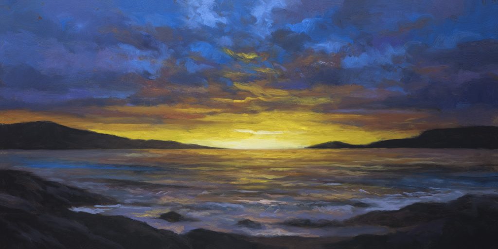
The painting I’m bringing you today is called Dusk’s Ember. It’s a 7×14 and I painted it day before yesterday. I was anxious to share it with you.
Maybe some of you noticed that I didn’t say welcome to another tonal landscape oil painting demonstration. I don’t think we can call this painting tonal. Yes, I use many of my Tonalist tricks in here, but it’s more like modern fauvism or something. Pretty saturated, the color. First of all.
The Origin Story
I did a smaller iteration of this scene. 5×10. Different composition, different color work. But it didn’t record properly. Camera wasn’t focused. Had to ditch that. Which was fine because I had some things not really worked out, like the color in the water.
So the next day I set about recomposing the reference image. Got it all together and proceeded to make this painting. The interesting thing: the original was 5×10. This is 7×14. It took the same amount of time.
I’m really happy with the way this painting turned out. One of the reasons I was anxious to share it with you today. It’s got a really cool, dynamic, beautiful feeling to it.
The Underpainting Problem
We’re doing the underpainting right now. That painting I did the day before, I was trying to work on gray and it kind of worked. But I had an issue where the gray board was peeking around in ways that just weren’t that good. So I’m leaving that painting alone. I’ll probably sell it or something. Not a problem.
But it’s really showing me that the gray is good for bluish type scenes and pretty much that alone. So we went back to our rich soil color here.
The black tone that we mixed for the underpainting: normally I would do Mars black and a little bit of burnt umber. But here I used Mars black, a little bit of burnt sienna, a little bit of rose matter, and actually I think I even slipped in a little bit of dioxazine purple as well.
In that smaller version I thought, oh I’ll just use ivory black. And I ran into all those issues I get with ivory black when I’m using it for darks: streaking, transparency. I’m making brush strokes and the color of the board is coming right through. This is one of the reasons why I think Mars black is superior for that sort of job. That’s what I used on this one and I’m really glad I did.
Blue and Orange: The Color Challenge
Part of the brief on this painting was I wanted to do blue and orange. Some of the people who saw the first iteration were like, “Wow, that’s dark.”
I didn’t feel it was. In fact I felt it was light. I get that sometimes in my studio. A lot of people come in and say “Why is everything so dark?” And some people come in and say “Look at the light.”
That is the point. You can’t have light without darkness. The two go hand in hand. I am very much into the extreme contrast. It’s pretty extreme in this case, not just from the standpoint of value contrast but also and most importantly from the contrast of hue. The orange is the opposite of blue on the color wheel. So in many ways this is a complementary color scheme.
I don’t know how nature pulls it off. When we’re looking at one of these glorious sunsets or sunrises, how is one cloud being picked out for one color and another cloud for another? It might be good to research. On the other hand I don’t actually mind having that be mysterious. I use a lot of artistic license.
The Transition Problem
If you try to move from blue into orange, if you’ve ever tried it, you get a real problem right away. When you start putting orange paint mixed with the blue you get the ugliest gray. Maybe it’s not that ugly but it’s not desirable.
So what you see me put in was a whole transitionary bunch of color. My go-to there was purple into red. Purple, red, orange gets on great. Even purple and orange get on real well. There’s enough red in the dioxazine. And dioxazine was the purple tone that I leaned on quite a lot here.
And dioxazine is not a mixable color. Any one of you that disagrees, welcome to tell me in the comments. That would make you the third person that ever disagreed with me on that. Then I’ll keep using my dioxazine to get the kind of results that I get. There’s a reason it’s on my palette because it’s a problem solver. It’s a color you can’t mix and it’s beautiful.
It’s also fake as hell. I mean if you add a little bit of white to that dioxazine you can see it looks like when we were kids and we had the Crayola crayons. That purple you get there is very much like a dioxazine. It’s not like a super reddish purple. But it’s very flexible. Easy to red it up using the matter or I also leaned a little bit into the Cadmium red here. I used quite a lot of the Cadmium red hue, which in the live sessions you often hear me referring to as my mixing red.
Because it has a lot of purposes. One is to give me a range of different oranges. Two, I can throw it into the green tones and get a good result. Most importantly I can put it into colors like some of my sky mixes that might be overly green and I can use it to adjust that.
Working with Fake-Looking References
Now here’s a real challenge. I loaded this up to one of my assistants, my composited reference, and it was obviously accessing some of these old laser postcards where everything looked fake as hell. All the waves were like this purple tone and everything looked a bit fake but it was definitely inspiring.
You can see in the live session how I took that inspiration and turned it into something that was still a bit different looking. Not 100% realistic maybe, but not gaudy or garish.
That’s the thing. A lot of times that reference image, it’s fine if it’s really gaudy. It’s fine if it’s screaming with color because what it’s designed to do is to inspire you as you paint. But you really don’t want to be putting colors on your painting that are straight from the tube or too bright, too saturated. You almost always want to make them feel a little more natural.
Reconciling Blue and Orange in the Water
One of the things I found: how do you reconcile these blue areas in the water with the orange? And I think I did a good job.
What we’re doing is laying down a more subtle, subdued version of the colors that would be coming over the top. That’s a great tip for you. You know you are going to get those bright colors in there. We don’t want to paint everything bright. What you want to do is have more subtle and subdued versions of these colors that are carrying a lot of the weight, then you just put some strokes.
I laid down kind of this more muddyish, reddy, orangey tone and now we’re coming over with a more saturated bright orange. And it worked really well throughout the water. I wasn’t sure it was going to work but I was okay with it. I do think it’s a saleable painting. I’d be interested to see what the market out here in New Zealand thinks of it whenever I get it into a gallery.
The Sky Series Returns
If you’ve been with me a while you know the Sky Series. This is a Sky Series type painting. It’s probably been about two, three years since I got into doing those and then things tend to go in cycles with me. When I go back in the studio on Monday that’s what I want to do. I want to do some more skies.
I keep a folder full of skies I’ve collected for the last 15 years that I generally will composite into my reference using Photoshop skills. These days if you’ve got Photoshop it will do the sky replacement very easily. There are other tools too.
Many of the skies I’ve collected are just over the top. You couldn’t really put them in a strong landscape scene because they’d be too dominant, too bright, too intense. When I was collecting reference, I stuck them in the folder because they caught my eye and I thought they had some artistic merit or potential. Many of those would be the genesis of a Sky Series painting because it’s all about the sky. The sky is the subject. So it’s okay if it’s crazy like this. Yellow, white, blue, boom, right.
Building the Water
That water is working really well. I had one of my fellow artists come in and say “Wow, that is working really well” and I totally agree with her. You can see how I had that sort of middley kind of tone down and just brought it in a little lighter. That’s a great technique for you guys to remember, and one I’ve been pointing out on the channel for years.
Don’t try and do everything all at once. It doesn’t mean you need to take all day either. This painting session took a couple hours, maybe a little longer, and we’ve got a beautiful painting.
Take good care of yourself, your family, all your loved ones. Stay out of trouble and fight the power.
Substack Studio Pass | The Book | Gallery | Supplies Page | YouTube | Members Area