Afternoon Stillness 6×8 – Live Painting Session!
Transcript and Key Insights
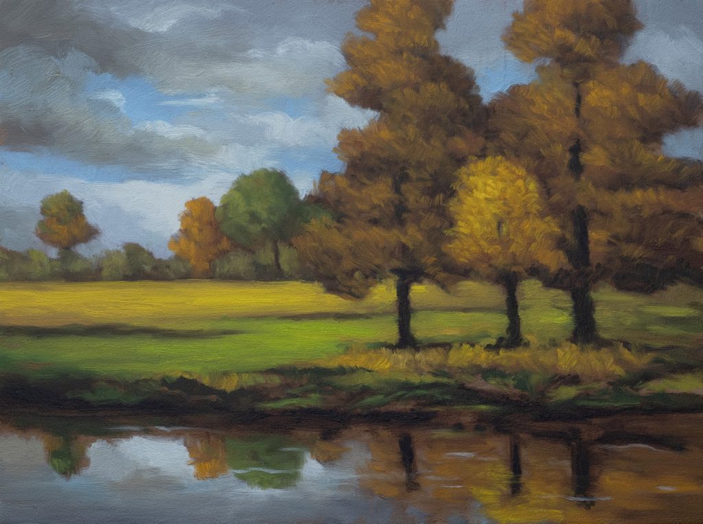
We’re doing a fall painting today, a six by eight. The reference came together through my process of working with master images and digital means to arrive at a composition. Fall scenes like this aren’t exactly common here in New Zealand. Up north, it’s all trees that don’t change color, so this kind of scene has a particular appeal for me.
The reference was originally set up as an eight by twelve, I’ve been really into that seven by twelve proportion lately, very addicted to it. But I decided to bring it down to a six by eight. One of the things I had to reconcile with this composition is that it’s a big bar of land with a pond. I just like painting ponds, and this is the nature of ponds, so we’re going to do things to make it work.
Note: I’m now adding new paintings to my store again every week. So if you love this you can buy it HERE. Also note if you find it’s not available any longer it’s because the painting has been sold.
In this painting the horizon is up high, but I’m going to put the horizon right in the middle. If that’s something you’re not supposed to do, I do it all the time. If you do it, you’re going to have to know how to balance things out. The trees in the reference are very light, so I want a little more contrast. I also made the trees bigger, filling up more space, which helps minimize the sky. Nothing special about the sky here.
Drawing it Out
I used a basic grid and got the drawing in. There’s a green tree in the reference I had to work hard to get in there, not such a big important thing, but it matters. There was also a really big tree I cropped down. It’s important to have the trees go off the top of the canvas.
The drawing went through a few changes, the horizon line came down, the trees grew. A few adjustments happened off camera, but you’ll see it when we get to painting. The drawing’s done. Let’s mix some color.
Color Mixing: Grays, Reds, and Golds
For the sky I started with a warm gray, mostly Burnt Umber with a touch of Mars Black. Then a cooler gray alongside it. You can use gray in place of blue. I’ve got a whole chapter on that in my book, not that you can’t use blue, but gray is a real option and it’s worth understanding why.
These trees are not going to be green. I’m going to use a deep red mix and amplify it with Cadmium Red, which is incredibly strong. When I brought in the Raw Umber, it made everything feel more natural, that is the main purpose Raw Umber serves on the palette. It will steal some of the color, but it makes things feel right.
For the oranges I started with Burnt Umber rather than Burnt Sienna, I didn’t want it too screaming. That gave us a beautiful, rich orange. For the grass, a yellow mix knocked back with Yellow Ochre. For the background grass I mixed one color and planned to pump it up as I painted, you don’t need a zillion variants on the palette.
Painting the Sky and Water
For the sky I used a Doss bristle filbert, a size four. Not too small, we don’t need to fuss around much with the sky. The reference is kind of a starting-off point.
For the water I wanted something very impressionist. I didn’t want a real fussy reflection. I noticed two shapes in the water that were too similar and distracting, so I worked to break one up more than the other. A little darker in the corners, keep it loose. I’m pretty happy with that sky. I think it looks nice.
Painting the Trees
I’m using a Robert Simmons filbert here and it’s doing something nice for the texture of the foliage. The dark tone goes in first on the lighter trees, you want to establish that before you start pushing the highlights.
For the green tree I added a little gray to the green because this tree is in the distance. I don’t want that color too in your face. That’s the principle, distant color gets quieter.
For the brightest lights on the fall trees I popped in some Cad Orange directly. When I was struggling to get brush coverage, I turned the brush on its side to get more paint. Always worth remembering, turn the brush and you get a fresh load.
One thing to watch: if you’ve got a single bristle sticking up out of the brush, get rid of it. It will wreak havoc.
The Grass and Finishing Touches
For the gold grass I knocked it down with Raw Umber so it doesn’t get confused with the trees. I also added some Umber and Ochre in the shadow areas. As I worked I kept the brighter highlights for last, if it wasn’t bright enough, I added more Cad Yellow.
There were some white highlights in the water I considered putting in, and I decided to leave them out. I think we’ve gotten a pretty good effect without them. At a certain point you’re just messing things up, and that’s the time to stop.
Take good care of yourself. Stay out of trouble. And fight the power.
Mike’s New Site | Substack | Painting Website | Mailing List | Store | My Music | Support | Members Area
M Francis McCarthy, Your Painter in Residence