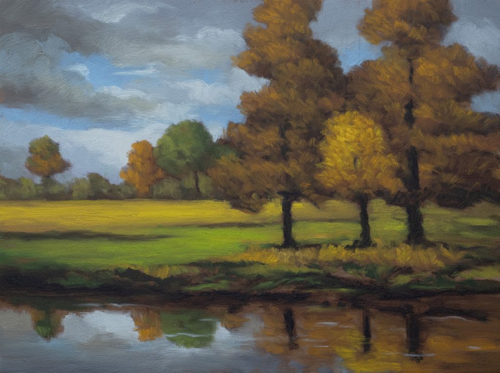
Afternoon Stillness 6×8 – 15 Minute Painting Session
Transcript and Key Insights
I painted this six-by-eight on three mil MDF, my favorite surface to work on. It’s totally smooth, very secure, and very inert. I like working on hardboard, but it has a subtle lump depending on the sheet. MDF doesn’t have that problem. Just don’t get it around water, ame constraint you’d have with watercolor.
The underpainting is burnt number with a bit of Mars black. Sometimes I like that little extra flatness it gives you. It depends on what you’re after.
Note: I’m now adding new paintings to my store again every week. So if you love this you can buy it HERE. Also note if you find it’s not available any longer it’s because the painting has been sold.
Composition and Reference
We’re painting a false scene by a pond, a theme I’ve been really into lately. This isn’t a riff on any one George Innes painting, but it’s informed by his compositional approach and sensibility. You can check out the reference image in the members area, along with a color mixing session where you’ll see my thoughts on the basic palette and which colors I think are key to pre-mix.
Pre-mixing is a really great plan. If I didn’t have time to finish a painting I started, but I wanted to come back in the afternoon, I’d do a color pre-mix and have it sitting there waiting for me when I returned.
The Sky and Reflections
The sky is fairly natural, gray clouds, blue, and creamy white tones. When I’m being clever, I try to get these sky colors down in the pond while I’m painting the sky. I did a couple here. The sky gives everything a fairly crisp feeling.
For the most part, I prefer to work alla prima, fresh every session, without additional layers on top. That said, with pond scenes I sometimes get mixed up with reflections. On the last couple I put on the channel, I had to come back the next morning with the camera still in place and make necessary changes. This pond turned out fine.
I’m not the world’s greatest reflection painter, but I think it’s best to keep it simple. If you’re going to get real fancy, you better know what you’re doing. I know a little bit about ponds and reflections, but I’m always trying to get better.
Trees and Dimensionality
In the reference, the three trees were samey. The center tree wasn’t distinct from the others. I made an aesthetic decision to make that tree lighter, ame coloration, but lighter value. This creates separation.
The other thing I was trying to do with these trees is have dimensionality while maintaining a distinct flatness. Georgia O’Keeffe used this technique extensively, and I did my best to do my impression of it. I didn’t have the reference on screen while painting, but I’ve done a lot of studies of her work. There are playlists in the channel if you’re interested. O’Keeffe is in my DNA. What I love about her work is the feeling of mystery and quiet artisticness. She was a true artist who believed in the power of making art, and I’m just a huge fan.
I don’t really get the desire to make straight-ahead studies anymore. I did so many for so long that these days I’m doing paintings that are informed by the masters rather than direct copies. It’s quite the evolution.
Making Sure Your Horizons Are Square
I’ve got a T-square out because I’m painting at an angle for the camera, I’ve been doing that for 10 years, so I’m used to it. But sometimes it’s hard to judge the straightness of verticals, and there are more than a few of my paintings with a bit of a tilt. Always make sure your horizons are square.
One thing I was pointing out in a recent underpainting session: make sure you’ve got at least a few trees that are very straight. Then you can tilt all you want with the rest of them.
Photographic and Synthetic Reference
Creating photographic reference is absolutely critical to the success or failure of your painting. That’s not going to be the case so much if you’re a plein air painter, you’re doing a lot of stylizing and simplification, just doing it outdoors. There’s a lot to be said for that.
One of my big influences early on was Stapleton Kearns. Every year he’d paint in the spring, summer, and late fall, sometimes winter. He’d take those efforts painted outdoors and finish them indoors later. He was a big believer in that approach and not really using photo reference, although he’d take lots of photos. His blog is still up and is so comprehensive, he covered every aspect of painting twice. I learned a lot from him.
But we’re all different. I live on an island where the weather is very changeable. Multiple seasons in one day is the joke, and it’s just not for me. I do like to use photographic reference, or these days even synthetic reference. It’s all just reference, my friends. At the end of the day, no one cares about your reference except you and other painters, you have a professional interest. But the common person is going to take the painting for what it is. They’re going to judge it for what it is. The reference won’t be moving along with it.
And here’s the thing: much of the lifetime of your painting, you won’t be around. People won’t know who you are or what you were about. They may have your name if you signed it, but that’s about all. The painting will be speaking for itself. How you got there, what you did, it’s less important. That goes for plein air, photographic reference, synthetic reference, digitally altered reference, whatever.
Texture and the Golden Field
We got the big payoff of the golden field. I decided to bring in another layer of highlights on the trees. This was a little flatter, and I was enjoying that, but I couldn’t help myself. Don’t get me wrong, I’m happy with it.
Because the trees were that color and the ground color of the board was the way it was, I was able to mess around quite a lot with just laying down dabs of paint and leaving bits of board around them. I got some very interesting textures that way.
With the center tree, I’m trying to dab in the paint without just brushing it in and covering everything up. That could be a challenge when you’re working on top of wet. My approach is to move my brush around and change the angle of the brush. There’s a lot of times if you’re doing a straight-on dabby stroke, you may not be getting the paint to move down onto the board. But if you turn your brush a little sideways, you will get the paint you need.
Medium and Darks
This is another reason why we need medium. I’m using Archival Oils brand odorless lean. I’ve also used the classic and don’t really see a huge difference between them. It has a consistency very close to linseed oil, and I use it much like any painter in the past would have used straight linseed oil or stand oil.
I use it to get the paint moving, and I use it quite a lot with the darks because I want my darks to go in nice and thin so I can put paint over the top. You definitely don’t want your darks too thick. If you’ve got big thick heaping helpings of dark paint, they’re going to be reflecting the light and the environment they’re hanging in, and that’s going to mess with the illusion of depth you’re after.
Glazing and Final Tones
The bifurcation of the lawn area was cool. I think this painting could probably benefit from glazing, omething I started to mention earlier. When you glaze, it only affects the lightest colors, not the darkest. I used to glaze a lot. I couldn’t help myself. But these days I do it very rarely because my work already comes off as quite dark, and glazing will make it feel darker.
That said, those light colors in the clouds, you can get effects and tones with a light glaze that you could never mix any other way. I think I will do that to this piece. I think it will bring home the whole tonal feeling.
I wasn’t shy with the saturation in this painting, and I’m pretty happy with it.
Take good care of yourself. Stay out of trouble. And fight the power.
Mike’s New Site | Substack | Painting Website | Mailing List | Store | My Music | Support | Members Area
M Francis McCarthy, Your Painter in Residence