Where Light Gathers 7×12 – Live Painting Session!
Transcript and Key Insights
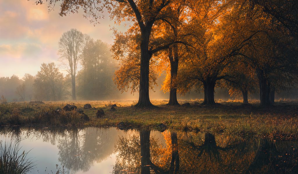
This is a riff on a painting by George Inness. I went through dozens and dozens of iterations of the reference to get here. I want to be able to give due to the inspiration for this image that I’ve created, but it’s very far away from the original painting ‘Early Autumn Montclaire’
Normally the M. Francis grid is subdividing the image into four quadrants. I divide it in half both ways. When I have a lot of things I want to make sure are in a certain spot, the correct spot, I subdivide it again at 25 percent, 50 percent, and 75 percent both ways. This gives you rectangles. Some of my students get thrown by that. They think grids have to be squares but, a grid just has to be something that works to divide the reference.
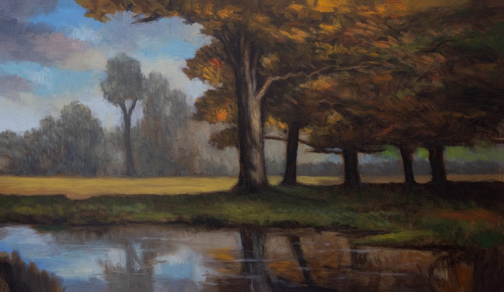
You can see that I have a really good composition here. I’ve got my main tree lined up right in the center, but there’s a lot of things offsetting it. And then there’s another strong tree at the 25 percent area. I’ve got a very good composition which I arrived at intuitively for the most part. It’s based on George Inness and his divide-the-painting-in-half and quarters kind of thing.
Key Compositional Principles
I’m not doing this more involved grid because there’s detail. I’m doing it because I’m very happy with the layout of the reference image. However, one thing I want to change is the spacing of the tree intervals in the reference. The horizon is not in the exact center, but it is taking up a lot of the bottom of the panel. It’s quite a high horizon.
You don’t want to ever do a tree that’s a three-pronged fork layout. We have foliage and things coming in here, so that’s all good. What you’re focusing on with painting is mostly your sense of aesthetics. What do you like? What do you think is looking good? This is 90 percent of any painting.
The tree in the reference is round, which I don’t like. I want it a bit different. The pond edge is arcing in the reference, but I want it pretty straight. The grid lines really help with reflections matching up. A lot of which is not just me, it’s the whole painting being done at an angle.
Color Mixing and Tonal Approach
I want this more tonelal. Instead of a plain gray, I want something with a little more interest. So we’ve got a gray with some purple in it. For the darks, I’m going to go with a Silver Grand Prix #0. I’m using burnt sienna in the color mixes as my acknowledgement of the tonal thing in this scene.
These are my darkest tones, a little too dark, darker than I want to be. I’m going to warm it up as we get into the lighter areas.
I’m leaning into the yellow ochre here because to me yellow ochre is a good receding color. The way I see painting reflections is, I’ve had some exposure to it, but not as much practice as I would have liked. Practice makes perfect with painting, especially with reflections.
Glazing: When and Why
I have to do two passes on this painting. Glazing will give me a chance to do more glowy stuff. I think it’s important to get the tree in first though.
When I finish the first color pass, the painting will benefit from glazing in the sky. It would enable me to do a proper scumble in the back, which would set it back even more. I’m enjoying the kind of raw feeling it has, but a glaze and a scumble would really improve it.
When I do glaze, here’s what I keep in my box: Indian yellow and transparent earth yellow. These are my go-to glazing colors. I haven’t used these for months, but it’s important with glazing to remember that it’s only going to affect the lightest portions of the painting. It won’t affect the darkest. So there’s no point in glazing a painting that’s very dark. All you’re going to do with glazing is change the highlights.
The Indian yellow used to be made out of cow urine. Now it’s a synthetic, they don’t make it out of cow urine anymore. It’s twice as strong as the transparent earth yellow. It’s probably one of the strongest colors in my paint box.
You don’t need an excess of thinned paint. Also, paper towel is the best way to apply a glaze. I fold myself some paper towel with a bit of a flat area. With a good coat of Liquin on the painting, it’s like magic when the glaze goes on.
The transparent earth yellow is a little bit green, so I bring back in balance with a little bit of the Indian yellow to give it a nice Tonalist feeling. Now it’s good. It’s very transparent, not going to have a ton of impact, but it is good.
Remove any extra paint with the paper towel roll itself. If I need to, I could get some spirits out and remove all of the glaze I’ve applied. I have had cause to regret doing glazing a painting in the past. If it’s not coated with Liquin, the glaze will permanently stain everything, so if you don’t like the effect, you’re in trouble.
Corrective Passes: Breaking the Rectangle
After finishing the first color pass, I was looking at this painting for a while, and that big rectangle shape was bothering me. After I finished, I couldn’t get past this. So I did a few things in my computer last night to get an idea how how I could improve it.
One thing we’re going to do is raise this up here at the bottom area of the main tree mass. I’ve also got a digital version I set up to guide me. I think we’re going to raise that other tree area too, just to break out of the rectangle feeling. I am also going to install a sky hole to break up that mass. It will help. Also I’m going to put a few little minor sky holes here and there. This back ara here is just crying for a glaze as well.
There’s a lesson here: if you really want to get that supertonal feel, sometimes you’ve got to keep working with the painting. George would keep fussing with many of his paintings, in fact he messed up a lot of paintings but over working them. Anyway we’ve improved this painting from the first color pass. That’s so much nicer. What a big improvement that is.
When to Stop
Stop when you start messing things up. You have to paint only what needs addressing in a second color pass, then stop. You’ve done everything you set out to do. There is a risk with doing a second color pass. This is one reason why I don’t like putting paintings back on the easel.
This glazing/adjustment pass took us half an hour and we’ve massively improved our painting. We’re deffo selling the Inness thing big time.
As promised my reference image is below. I referred to this and Georges original while painting.
Take good care of yourself. Stay out of trouble. And fight the power.
Mike’s New Site | Substack | Painting Website | Mailing List | Store | My Music | Support | Members Area
M Francis McCarthy, Your Painter in Residence