Coastal Cypress Evening 5×7 – 15-Minute Painting Session!
Transcript and Key Insights
This painting started with an unconventional choice: a gray underpainting instead of the usual rich soil or reddish-brown we typically paint on. I used a tester pot from the paint store, inexpensive and effective. You can grab one yourself and look at the chips to decide what colors you might want to paint on. It’s probably the most inexpensive way to prep your boards.
Some people have come back to me concerned about archival quality, but if you look at the label of any professional gesso, it’s all made out of acrylic. One bit of plastic is much like another, especially once it’s dry. What matters is that it stops the board from absorbing your painting, and that’s what you want. I usually do three good coats.
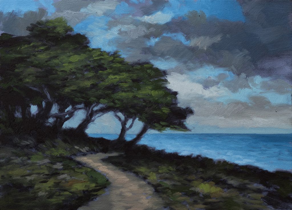
I chose gray specifically because this scene is predominantly cool in tone. I invoke the gray when I’m painting a scene that’s either monochromatic, like black and white, or when the scene is predominantly cool. That was definitely the case here. If you want to see the reference image, it’s in the members area on YouTube and also on Substack. When you join the members, you not only get an email telling you when the video is available, but that email includes the actual reference image. I do quite often release a version of the live painting session a little later in the week, just to be nice.
Mixing the Underpainting Color
The underpainting itself was interesting. I started with Mars Black and put in a little Burnt Number. Then Perylene, and things got really green, crazy green. So I had to cram in a bunch of Rose Madder, which is very much like Alizarin Crimson for those of you that don’t know the color. That gave us this color, which I thought was really groovy. It was kind of a little bit purpley.
Working on a gray like this, it isn’t a neutral color. It takes on all sorts of attributes depending on what colors go over the top.
The Sky Strategy
The sky came out really groovy. I had a nice sky in the reference image and couldn’t wait to paint it. I mixed a couple blues. A big tip for those of you looking for tips: the best recipe for the bottom of the sky is whatever blue you’re using, it could even be ultramarine, white, and then yellow ochre. Yellow ochre is the golden ticket because it creates that warm, luminous quality at the horizon.
Yellow ochre could have a bit of a greenish tendency, but a certain amount of that is acceptable. What I tend to do, depending on your blue, is balance it out with a little bit of what I call my mixing red, which is the Winton Cadmium Red Hue. It’s not actual cadmium red, it’s a lot weaker, but it’s a wonderful color for mixing other colors, and that’s why I call it my mixing red.
I mixed a darker blue for the top of the sky and a lighter blue for the bottom. I did warm up the gray subtly, but not too far. I didn’t want to get into really brownish grays. I used that as an accent tone.
The Clouds
For the clouds, I’m real happy with that kind of dark color. I had an inspiring color in the reference and that’s not far from it. I decided to start bringing in a little bit of Diox Purple. It’s subtle, but you can see it right away, that gray board seems to take on kind of a purplish feeling on its own. I mixed a few brownish colors for the sky, but only as little accents. Mostly I worked with coolish grays, the subtly purple-tinted color, and then warmer, creamish tones. I’m real happy with that.
A Strategic Choice on Bright Values
In the reference image, we had a bright white area, but it was up at the very top of the sky and it looks fine there in the photo reference. But that’s not something I like to paint. When you have really bright colors at the top of your painting, either really saturated or really light in value, they tend to be eye-catching. You always want to be strategic. My favorite thing to do is pop them up against the mass of the trees, and I’ll do that religiously basically.
On Inspiration and Authenticity
My initial inspiration for this scene was a painting by Isaac, I can’t remember or pronounce his last name, but the first name is Isaac and the second starts with L. He’s a Russian painter with a pretty famous purple painting, very similar to this except it doesn’t have an ocean. It’s very different but similar, and I used that as inspiration for a digital ride, is what I did. One of the first things I did was remove the purple cast because that would have been almost identical to what he did, except my silhouettes of the trees are different. I’ve got a path. I’ve got different elements.
If you were to see his painting, you would say, “Ah, I see where he got that inspiration.” And that’s the word of the day: inspiration, man. You’ve got to get it. It’s got to come in some form or another. Who better than the masters to inspire us to create new works that are related but not the same? Humans have been doing that since humans have been making art. There’s no shame in it.
I don’t have any real concern with being a quote-unquote original. My concern is with being authentic in my manner of expressing myself. That means I follow that thread of inspiration. If I do work that’s a copy of another artist, I always give attribution. But there’s a place where I’m not going to call this a study after Isaac because it’s just inspired by him. It’s not a copy or study of his painting. It’s important to make this distinction.
But it’s also important to do faithful studies after painters that you admire. I’ve been painting a long time and I’ve made a lot of studies. They’re all up on the channel. If you go to the Patreon area, you’ll see there’s maybe 100 paintings I’ve done after Innes, maybe 60 or so after Corot. It’s all there. I’m Mr. Warts and all.
Water and Greens
I didn’t want to get into the aqua thing because everything here is kind of pivoting off of bluishness. All the greens are sort of cool. When I was mixing those greens, I put a little bit of Prussian Blue in there. I also leaned on Perylene Black/Green, which is really a green. All you’ve got to do is introduce the lightest bit of white to it or yellow and you’ll see how green it is immediately. It’s my phthalo green replacement and it’s very cool. It’s a wonderful color, a very giving color.
I did use Mics Green. A lot of times what I’ll do, if this was a less cool scene, is just add Perylene Green into Mics Green to get my dark, my darkest green. I did something like that here, but I just did a little bit of that Prussian too, which I ain’t ashamed to do. I ain’t shy about that.
Restating the Darks
We’re coming in and restating some of the darks. I basically just used a bit of what I had mixed and I kicked in a bit more Mars Black just so it would be a little darker.
The Silhouette Principle
When you look at the actual inspiration for this, it’s basically a silhouette. There was almost no amount of foliage you could see in the land or the trees. They were so dark against the sky. And that was quite graphic and beautiful. But I tend not to do it. I tend not to go full silhouette. You can go close, but you don’t want to go all the way there. You never go full silhouette in your paintings.
I kept that dark ridge up against the ocean there, and I felt that it worked. There’s a line between powerful restraint and losing information entirely.
Selection Criteria
I do quite a few more paintings than I can share. I could do three or four a week, but I think people would get a little burnout on it. My criteria for which ones I select: One, do I love it? Two, is it somewhat different from the last thing I put up? And three, will it help you learn something? Is it something that’s going to be a little different? I think this painting satisfies all three.
Take good care of yourself. Stay out of trouble. And fight the power.
Mike’s New Site | Substack | Painting Website | Mailing List | Store | My Music | Support | Members Area
M Francis McCarthy, Your Painter in Residence