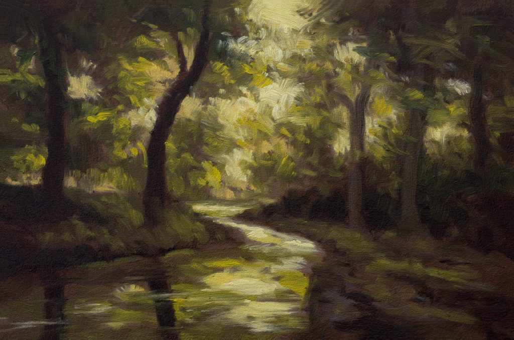
Woodland Stream 4×6 – Live painting Session!
Transcript and Key Insights
Good morning, evening, or afternoon to all my friends. I’m going to paint a kind of forested creek scene today, something quite atmospheric. I actually painted this subject a long time ago, and it was really successful; I thought it turned out beautifully. However, I gave that painting away, so here we are again.
We’re still in 4×6 mode, my friends, and I’ve got a couple more of these sizes to do, maybe two or three more before I switch things up. I want to make quite a few of these small studies because they are such effective tools for learning and keeping the hand loose. Since I only have one or two in since I decided to commit to this size, we’re not that far along yet. There is still room to grow, so let’s dive back into the process.
Preparing the Palette: The Importance of Umbers
Before we even touch the board, let’s talk about our materials. I am going to use raw umber and burnt umber. You will probably see a skin on the raw umber; that is always a good bit of information for you. It tells you how long it has been sitting out. Still, you don’t want to be without those umbers in your palette. They are incredibly versatile anchors for your neutrals and darks.
They are also cheap, which makes them ideal for this kind of experimental work. Yes, they do dry on the pallet quickly, but since they are inexpensive, it is not a big deal. Just scrape them up and replace them with fresh paint. What I don’t recommend, however, is keeping all that dried paint sitting there indefinitely. If you let it get too old or crusty, it can start to introduce unwanted textures or “baubles” into your painting, which might ruin the look of your painting’s surface. Keep your palette clean and active, but don’t fear the cost of replacing these essential earth tones.
Establishing the Underpainting and Composition
Now we are going to do our under-drawing. The scene is very green here, so I think raw umber will help us establish that base tone. It’s not bad as a starting point. That’s working well. We have our burnt umber down, and I am adding a little bit of rose madder to it. As you can see on the palette here, that mixture is quite reddish, but that’s okay because this is fundamentally a very green painting.
We are going to make it feel like a green painting, which dictates how we will approach the color mixing later. The key to greens, and if you’ve followed any of my recent talks or teachings, you know this already, is that red is essential. Even in a scene dominated by foliage and water, you need that complementary contrast to make the greens sing.
I’m not going to grid the board; I don’t think we really need to for this small painting. However, I do think a bit of a horizon line will help ground the composition. It’s interesting how much light drives this particular painting. I put a link in my last video to Rachel DeLue talking about George Inness.
This painting kind of has little going on except for the light itself. It’s very subtle. Of course, there is a little pond or stream in the middle. Let’s do that first actually. It could have gone the other way there. I think I’m going to make it straight-ish, probably what I did last time as well. Yeah, I like that tree form, but I keep thinking if I could push it further back. This is made up from memory and observation combined. I think it might be nice to have more depth there.
It’s all going to be about broken light anyway. This is what I’m painting right now: broken light filtering through heavy foliage. I probably don’t want to go too far with the distinct foliage shapes because, in the end, it’s all going to turn into just light. We are going to have a demarcation there, a shift from one light tone to another. Okay, drawing is done.
Color Mixing Session: Building the Greens
Color mixing time. We’ll start with the lights. I’m pretty happy with that initial color. Now I need to do the darks. I don’t know why I started with the lighter ones this time! I do a lot of paintings that have similar challenges: light breaking through heavy foliage. That’s a thing with me; I do it all the time. Usually, it involves a path or something more defined, but here I want this to be a little darker.
A lot of times, I’ll let the shadows go too dark too quickly. Maybe I should have gone a little more gray on that darker bit initially. Here, I definitely want this feeling of yellow-suffused green light. That direction is key for capturing that forest atmosphere. Anyway, I started talking about that Rachel DeLue video earlier. She was discussing Inness’ work… I got to read the book again. I don’t know if I ever read the whole thing; I think maybe I did. I wrote my notes on it in like 2005, and I probably bought the book around 2011 or 2012. It’s been a while!
Okay, now we’re into the whole range of greens. All these greens are quite warm, but that doesn’t mean we can’t start with some Perylene Green. There’s a tiny bit of skin on that, which is fine. Nice green. Probably if we have a break… yeah, I probably will make more of my green tone. That’s nice. That’s dark, but I want it a little darker still. I think I’m going to add Burnt Umber to it.
Nice. That has got the warmth I want without being overly warm, because we are going to go into much warmer tones later. Okay, so now we have our middle green. And almost equal parts… I talked about this in the talk I just did yesterday about strategic color placement. It’s all about perception. Look at that: you can chuck in huge amounts of Burnt Sienna into your greens, and they are still perceptually green. But it creates a nice little platform for the colors to go deeper and darker.
Oh, I didn’t even do my darkest dark yet. We did now? Okay, then we’re getting into these other variations. Now that’s still looking a bit fake or artificial. Just keep stepping on it. I like that. I think I’m going to have to really blast it into another tone. That’s probably where I need to be.
I’ll keep some of that in reserve for the lighter greens. If you really want to push toward green, you will see me leaning into Cadmium Yellow. I am going to push this color into a slightly more orangey space. We are going to mix a couple of colors specifically for the ground and the water. Most of the colors in the stream or pond, whatever it is, are pretty similar, I’ll say that much. It’s kind of subdued.
Full Painting Session: Applying the First Layers
We’re back! I picked out a foliage brush, I really wasn’t thinking about this specific one, but it should be okay. I was looking at the Princeton Refine, which in some applications would be fine here, but I’m going to use this brush for now.
Just one little movement… you saw it really slowed down there to get that oil distributed properly? Yes. I don’t have the reference exactly huge on my screen; I’m making it as small as I can go here, which forces me to simplify. There’s a couple of shapes I don’t like in the reference. There is this big kind of C-shape from the main tree mass.
Hopefully, you had a chance to look at the reference during the color mixing session. The reason I bring it up is that I want to break that C-shape up. I don’t want it to be so prominent or rigid. Okay, back to Rachel DeLue and George Inness for a moment. It’s been a long time since I listened to her talk and read her book, but one of the things she was on about, and what I believe Inness believed, was that as people, we don’t really “see” in the traditional sense.
Much of what he does with his painting is endeavoring for us to see reality as a spiritual experience. Which, you know, is a romantic idea. I wouldn’t say my own motivations are quite so direct or spiritual, but like George, I am not as concerned with creating actual photographic realities. I am concerned with expressing my emotional response to what’s going on in the scene.
In the reference, it is obviously a reflection of the time and place, it’s everything at once. I’m just miles away from where I mixed some of these colors. And you notice I just keep chucking in more and more Cadmium Yellow. It helps warm things up.
I believe what I am going to do is just wait to go to that pure white highlight. I think I’ve got enough value contrast there that I wouldn’t usually need to be so cautious. But in this particular painting, I’m going to go straight into the darkest color first.
I am into the darkest values now. Now that wedge shape? I’m going to be diminishing that. That’s not going to be as present in the final image. Okay. I don’t want any real outlining here on the trees, but I’ve got to do something that reads as a lighter-colored tree trunk or branch against the darker foliage.
I’m pretty dark on my brush here… too dark? It looks fairly red on the palette but quite green on the board. Interesting shift. Now, last time I painted this subject, it was in my “textured phase,” which lasted a couple of years. I don’t have that great a desire to paint on heavy texture anymore. I think I did one last year. For textured boards I have to really adjust my brush technique because I’ve got to push the paint into the crevasses of the texture, and I find it limiting now.
As red as that looks on the palette… it doesn’t look that red here in application. I think I’ll be coming in there with a few more darks. Okay. I am going to really start driving in some greens. I’m sure not to “green” the shadows too much, but given how things have been going, I think it should look pretty dang green overall.
Okay. I said green earlier, so I am going to go very green. We got a whole bunch of lighter greens coming up now. The thing is, because I’ve been pretty liberal with the paint application, I am going to have to bring in a little more oil medium to keep it flowing.
I’m thinking this is the time to get the lighter ‘sky’ bit in. This is going to seem a little shocking at first glance, just letting you know that jump in value can be jarring, but it’s necessary for the light effect. I am going to come in with a few more darks, so I need to be real careful because I’m actually pretty happy with the overall effect right now.
I could almost walk away right now. But I definitely want a few more darks here and there. And I mean a few. We are not going to overwork it. Because if you overwork this, you could mess up the harmony.
Final Touches: Leaving It Vague
The reason adding too much detail could mess this up is because we’d be bringing in more definition. Right now, I think one of the strengths of this particular painting is that it is not very defined. Some need to find their way through the foliage via value contrast alone, not line work.
I wanted to do something there, but I don’t want that specific shape. I am just going to leave it vague. This is the “Leave It Vague” painting. All right, we’re done with the main structure. Just going to let it live. Let it be.
It’s a bit chunky in spots, which I like. The texture of the brushwork adds energy. I’ll do two seconds more softening now. I put my glasses on, which entails wiping off this brush… just a little touch here to blend that edge. Just a little.
I like this. We’ll leave the chunks that are there as they are; they add character. It captures that fleeting quality of light in the woods without over-explaining itself. That’s all for today, my friends.
Take good care of yourself. Stay out of trouble. And fight the power.
Mike’s New Site | Substack | Painting Website | Mailing List | Store | My Music | Support | Members Area
M Francis McCarthy, Your Painter in Residence