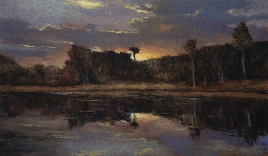
Violet Dusk 7×12 – Live Painting Session!
Transcript and Key Insights
It’s morning, 9:32 on the 29th of April, 2026. Clear blue sky, no clouds. We’re going to make a painting now.
This reference has one big issue. What I call all in a row syndrome, distant row of trees and hills, just a horizontal slab of whatever in the foreground. But there’s a big exception here. We’re in the water looking at the shore, and we have reflections. That’s going to create interest. I grabbed this from a screenshot from a very old movie. Don’t know the name of it. There’s a big dark mass that was just blowing out artifacts. I’ve had to lighten it and lighten it, trying to pull information out. The reference itself is lacking. It’s almost there as far as being something interesting to look at, but not quite.
I’m calling this Violet Dusk. The violet’s just kind of hinted at. We’re going to be playing that up. I’m quite excited about the painting I’m going to make from the reference.
Setting Up: Board and Drawing
Got a 7×12 board here. I wanted to do an 8×14 but 7×12 is nearly the same thing proportion-wise. This is semi-panoramic. Those 8×14 proportions, if Georgius was going to work panoramic, that’s what he would do. Mostly he just worked golden mean. That would be something like an 8×12 or 24×36.
I’ve got the horizon line. I did make a copy of this and mirror it for the reflection, but I used various tools to integrate it into what was there. Give it some variety and difference. I don’t recommend with this kind of painting you do an exact reproduction of what was above the horizon below in the water. We just want to get a feeling across.
I’m going to juice up the burnt umber. That’s a purple. The first time I’ve done that, it might be worth investigating on its own. I’m going to add a little black though. This will give us some overtones and undertones. I know I want purple in the DNA of this. That’s why I’ve given it the title I have.
Careful with trees breaking these hill-type things. These two trees in the reference are the same size. Very close. Well, this one is smaller. You want one bigger always. That’s why I’m adjusting them. What I’m trying to do is make sure you don’t want everything all lined up. You want some variance.
Here we got a spot that’s very interesting. Just this dark mess and it actually goes down into the water. I don’t know what exactly is going on. But we don’t have to figure it out. We don’t have to divide everything either.
Be careful with things like that. They start taking on their own kind of reality. Next thing you know they’re a pretty strong subject. And it’s called Violet Dusk. So I want things dusky. I don’t want anything super defined.
Don’t, if it’s not defined in a reference, don’t be the one that defines it in your painting. Keep it in the underdone form. Indicated.
The Sky and Color Strategy
The thing that makes a whole painting work is where I get some color in there. And the light from the sky. That was the reference. Actually, six years ago I had a professional photographer friend. He was doing a super shallow depth of field outdoors and bringing these out of focus skies. Beautiful technique. He had several out of focus skies in a folder, and that’s what this is. I’ve used it many times.
Be super careful with stuff breaking up into the sky. Anything breaking into the sky comes to subject. So be careful.
Most of the story here is just told by color. It’s reminding me of a study after Dupree. The colors are different, but it’s very similar. You’re on a boat in the water looking in. He used to do that. Used to get on a boat.
Gray is so predominant. The yellows there were way more intense. It’s a little bit lighter. That’s the great trick. The slightest amount of blue brought into the gray. That’s the blue trick maybe.
There’s a color in the sky. Secret red and secret blue. That’s my basic sky tone and I gotta really remember to do both the sky and water same time. Otherwise, it’ll mean a bunch of extra color mixing. It’ll mean a bunch of headache. And I don’t always remember to do that. Usually I don’t.
Color Mixing
We got two marshmallows go in here. I’m mostly putting my emphasis on this one because I don’t need that extra juice. It’s basically like straight up raw sienna.
Now our dark cloud color. Pretty much diox. I’m going to add a little white just to wake up the diox. It’s nice, it’s a little dark. It’s a little cold. I like that.
In the reference it’s more just plain gray. Here we got some purples. And I think that’s good.
Gray is a very flexible tone. Notice here we’re switching to the yellow ochre which will give us some lightness as well. This is designed to be rather more transitional.
All these colors involve white and it is the same thing but all the colors are going to involve black and burnt umber. Between the two, those are going to tell 90% of the story with some reds.
Burnt umber by its nature is very transparent. So we’re setting out to make a less transparent burnt umber here. That’s a pretty color. Put a little purple in that. Just darken it.
Black is very much related to umber. No question about that. It’s way more intense. It’s way more dark. And it’s not more transparent. The ivory black is extremely transparent as is raw umber.
One day I might just, you know, if I was a super successful painter working with paint companies, one of the things I would do would be do a mix up of tubes of opaque umber. Because I find that’s something I’m having to do all the time.
In general we have our colors mixed. We are good. The colors are mixed. You can see the story. It’s a never-ending one. I know it ends when I end. But God willing I can do this for another 20-something years or longer.
Painting: The First Session
Back from lunch. You know what though? I think we have a very low quality of Mike’s gray. I’m going to make some more before I start.
Use the cheap titanium. It’s got zinc in it but for me it don’t matter too much because everything I do is on a board in the mix. If you’re on canvas don’t do it.
It’s pretty dark, eh? Too dark. Not by much. Better a little too dark than too light. Also you can keep messing around. It’s within a range. That range is acceptable.
Okay, we’re ready to start painting. I already got a brush. I’m ready to paint. I’m ready. I made my tea.
What’s our brush? It’s a Das Bristol Filbert. Fairly new. It’s a four. Smaller than most people’s fours but we’re okay.
This is a good spot to remind you, you got all sorts of ideas for your painting. I usually have just fairly limited set of ideas of things because I’m mostly interested in how the painting is going to manifest as it’s getting painted. The reason for that is because I’ve learned that every painting takes on its own. Like this one’s got a lot of flop going on with this brush. There’s a bit more texture on the board than I’ve been doing lately. But I think it’s working out. It’s okay.
What I was saying is just get those shapes. Interesting shapes. It’s all about shapes and values.
We’re going to need to do more in the sky but I think that’s what we can do for now. This is not going to be a tight painting.
I do want to do some accents on the clouds. I just feel like I got to wait a little bit. Certainly not going to use that big brush for those. Probably a two.
Good to give it a little break. I’m going to use a new brush. Otherwise every brush in your jar ends up being worn out.
I think that’s actually one of the best jobs I’ve done with these highlights yet. So that’s a good thing. That’s working really well.
Alright, painting’s done. I’m going to have a look in the camera real quick before I turn everything off, because I’m pretty happy with it. I think that’s getting across what I wanted to do.
The Next Day: Final Refinement
Well, we’re back. I’ve been looking at this painting. I think it’s a really nice painting. It looks really much better. It hadn’t gone matte yet, so we’re pretty lucky. As far as videography goes.
My problem is I want some streaks or something in the water. And we’re going to have a bit of a challenge. This painting hasn’t got a coat of liquid. So anything I put down is pretty much where it’s going to be.
I looked for some reference that would give me some of these. The kind of thing we’re looking for is like Bob Ross would do it. He couldn’t stop himself. These little highlights along the edge of the shore, for example. Little catchy little bits of horizontal. We don’t need a lot, but we don’t have any reference. We’re going to just have to use what they call restraint. Artistic restraint. I don’t want to mess up.
I found a reference of a Dupree I made a painting of. He did a masterful job. Of course he got a lot of different stuff going on there, but it would be good for some inspiration.
Now I got two brushes here. First thing we’re going to do is kind of make a color that will be nice for the water. It doesn’t even really matter too much what color it is. That’s pretty good. Neutral, right? That’s a little on the light side, but that should work. We got our oil. That’s great.
I did just boil the kettle. I’m going to get a coffee here. I need coffee. It will improve it. I mean, it’s always a risk. You know what? I really like this painting. I want to put it up on the channel, but I had these issues.
Okay, we’re going to start. I’m looking for a brush that’s not too splayed. It goes nice and flat. The thing is, like I said, any mark I make, it’s there. It’s on the painting. Is there a good plan? I don’t know. I don’t want this to… I better off starting too dark. Because like I said, once I make that mark, it is there. This will definitely seem lighter than you think.
The color’s wrong. It’s a little more red. Let’s improve it.
Okay. Now it’s looking like water, right? I don’t want too much. You got to tell me that has not really improved it. It really has.
I make a mark. It’s on there, but we can knock it back. I just don’t want every mark to be the same.
I like that. That’s probably enough. Cool. The best plan with these kinds of chunks is not to chase them like I’m chasing them. That’s nice.
I kept things super loose on this, and I’m happy with that. I don’t want to change too much of that.
When things start going, oh, not so good. Time to stop. One thing that’s occurring to me, though, is we don’t need just… We can put a few dark bits in the water to talk about taking chances, but… I do think we’ve done some nice things here. See what I mean?
Okay, we’re going to call it a day. I feel much better. That’s how we go.
We’re looking at the camera. Oh, that’s looking better. It’s subtle. These are subtle changes, but important. I think that reflection looks more reflecty now, okay? Now we had to do it. We had to do it. So now we can go on the channel and everyone can appreciate it. It’d be lovely.
Mike’s New Site | Substack | Painting Website | Mailing List | Store | My Music | Support | Members Area
M Francis McCarthy, Your Painter in Residence
Take care of yourself. Stay out of trouble. And fight the power.