Matapouri Bay Dawn 5×10 – LIVE Painting Session!
Transcript & Key Insights
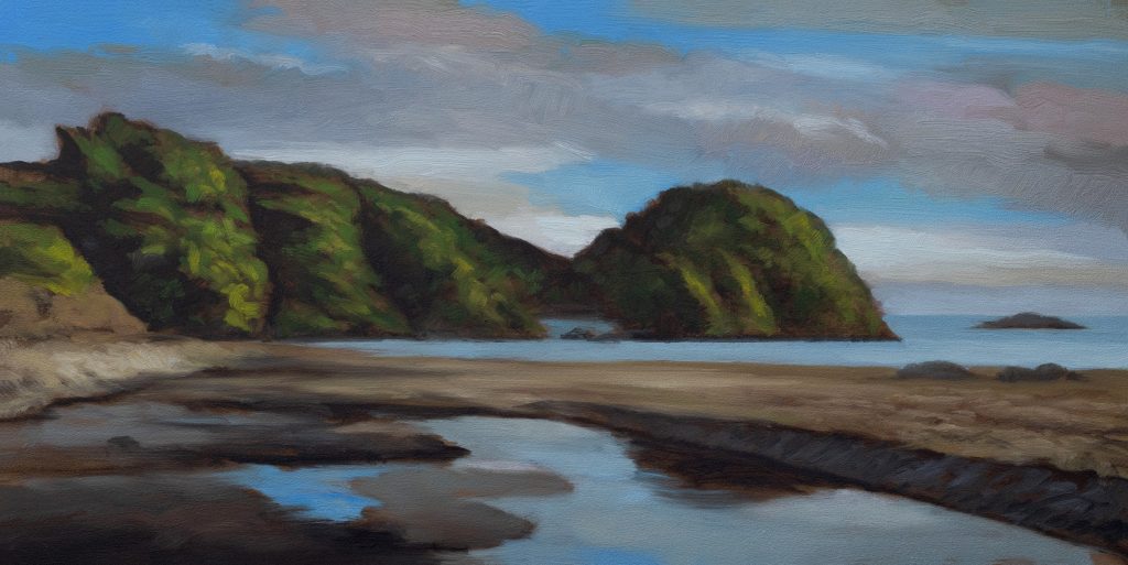
I’m working on a 5×10 today, and I want to keep it loose and impressionistic. The goal is that daylight, fresh morning quality without getting bogged down in detail. I’ve done this many times, but I want it to have that impressionistic interpretation of the scene.
Starting with the sky: very basic, but it needs that soft quality. I’m mixing an off-white for the clouds, and here’s the thing—you can’t just use buff straight up. It’s too something, too monochromatic. You need complexity in there. I’ve got quite a lot of yellow in some of these clouds, so I’m bringing that in, then going lighter with titanium white. The whole idea is to keep it fresh.
The Cool Grays and Values
For the cool grays, I’m using ivory black and titanium white—both cool pigments, which gives you that natural cool gray. I’m keeping them lighter than the darks, creating separation. I want room for variation in the sky without it getting too polished or tight.
Water: The Duplicate Strategy
Here’s a key thing about this composition: that whole area down in the water is essentially a duplicate of the sky. So really, all I need to do now is establish some sand tones and darks. The water’s going to read as water just from the values I’ve already laid in.
The Darks: Keeping It Clean
For the darks, I’m using Mars black. The last painting I did turned out well, and I basically just reinterpreted a scene I’d painted before because I wanted that painting back in my life. This time, I’m keeping things clean and fresh—I don’t want to bring in a bunch of reds and muddy the mix.
I’m giving myself a nice rich dark green. Perylene black has this great quality—it doesn’t dry that fast on the palette, which is useful when you’re working.
Sand Tones: The Umber Route
The great thing about umber is you can get a really nice range of grays without any black in it. That’s what I want—good warm grays. My first sand is a grayish brown. The umbers are perfect for this because you can get a nice range.
Then I’m mixing a second sand that’s more yellow, and I back it off with a little burnt umber, which has red tendencies. That gives me variation without things getting too hot or too cold.
The Painting Process: Staying Loose
I want to keep this loose, keep it discernible as far as the location, but not tight. New brushes are great for skies—they’re nice and even straight out of the gate.
One thing I’m thinking about: in the reference, there’s no blue in the bottom part of the sky, but I think I want to put some in. Blue reads as water, and even though there are only streaks of blue, it helps sell the feeling of the location.
I’m breaking things up as I go. When you make a decision to deviate from the reference, it does put you at a little more risk because you’re pulling away from what’s actually there. But sometimes that’s necessary to make the painting work better than the reference does.
The Island and Water Details
Those logs in the reference are black, but I’m handling them differently—they’re going to sit back. I don’t want to overdo the sand. What I do want is some grays in the water and sand area.
With this island I’m painting, I’ve got to raise it up so it reads properly. The brushy quality is important—I like how you can see it’s a painting. That softness, that texture, that’s what makes it sing.
Wrapping Up
I could keep working this, but I’m really happy with where it is. I want to leave the brushy quality intact. That’s the whole point—loose, impressionistic, saying what it needs to say without overexplaining it.
Take good care of yourself. Stay out of trouble. And fight the power.
Mike’s New Site | Substack | Painting Website | Mailing List | Store | My Music | Support | Members Area
M Francis McCarthy, Your Painter in Residence