The Winding Way 6×8 – Live Painting Session!
Transcript and Key Insights
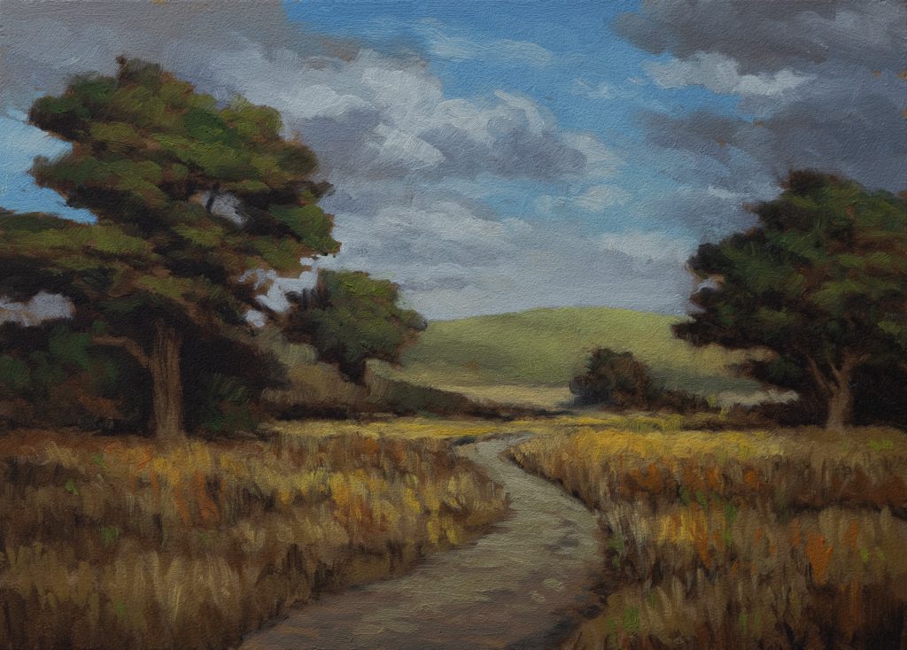
This photo is from about 12 to 13 years ago, just a basic image of a field with a couple of trees in the background. On its own, it’s laughable. But I set it aside a few weeks back because I really liked those trees.
Here’s where modern tools come in handy. I used AI image generation to help compose the reference, and I think that’s a genuinely great use of it. I cut out a section and asked for a country road, and the AI did a better job than Photoshop ever could. Otherwise, this would’ve just been an empty field, which doesn’t work visually.
One thing I noticed: the two tree masses in the original reference were quite far spread from each other. So I used some techniques to bring them closer together. I made a duplicate, brought in the other tree, and repositioned it. Now I’ve got something that actually works as a composition.
Starting the Drawing
We’re working on a five by seven today. I grabbed this size because I wasn’t thinking of making anything too big, the economy’s been challenging, and I like to build up my inventory of smaller paintings.
Let me talk about the trees themselves. The first tree doesn’t have a trunk in the reference, but we’re putting one in right now. I learned this lesson early on when I was still in California. A lot of those California Oaks have foliage that goes all the way to the ground, no visible trunk. And I discovered very quickly: a tree without a trunk is a bush. Write that down. It’s one of the most important lessons I can pass along.
The second tree in this composition is about three-quarters visible. Here’s another critical tip: half a tree never works. Three-quarters of a tree works. A whole tree works. But half a tree just falls flat.
Breaking Up the Composition
The road in the reference is a bit too windy from the AI generation. I used the liquify tool to de-windify it somewhat. I want some windiness, that’s natural, but not so much that it becomes distracting.
One thing about this field: there are red weeds flowing in horizontal patterns. I don’t want to stick to that 100%, but I do want to break them up. You never want anything too uniform. It’s the same principle as wave rules in ocean painting. You don’t want to draft too much in these situations. Let the paint do the talking.
When I look at the reference, I see zillions of sky holes, little gaps where sky peeks through the foliage. That’s something we’ll address as we paint.
Key Lessons in Tree Work
The third tree in our scene has a lump-like shape in the reference. It’s not the most beautiful form. Here’s the thing: use what’s good in your reference, but if a tree doesn’t have a great shape, do your own thing. Some of your trees will have noble shapes you can emphasize. Others need your artistic intervention.
And again, if we can get a trunk in, it won’t read as a bush. Bush syndrome is real. No matter how hard you work or how good your painting abilities are, ultimately a tree without a trunk is a bush.
I’m watching out for one-two-three patterns in the composition, where elements line up in a row. That’s monotonous. I want rhythm and variation instead.
The Color Mixing Process
Let’s talk about what we mixed for this painting. I started with blue, Art Spectrum, though the brand doesn’t really matter. I added a little umber to bring in more warmth, and some ivory to lighten it.
For the sky, I’m not going too dark. I made a little patch of blue to have on the side for reference. The sky in our reference is quite a bit lighter than my initial mix, so I adjusted by adding a little burnt umber to get closer to that tone.
The key thing here is complexity. That complexity, along with brushwork, is what makes paintings sing. You could have virtuoso brushwork, but if your colors are too plain or too non-natural feeling, something’s missing.
I made several gray tones, a warmer gray and a cooler gray. For the warm gray, I used ochre with a tempera-based red to bring in some greenness. For the cool grays, I used mics gray. The idea is having variation so you’re not just painting one flat value.
For the whites, I used yellow ochre and raw umber as a base. I didn’t want it too creamy or too yellow, but there needed to be that yellowness to it. Then I brought in some buff titanium for my lightest light, and just a tiny amount of cadmium yellow, watch how that has a giant impact.
Big tip: if your color mix starts going off the rails and you’ve added too much paint, put some aside. Then start adjusting. Often you can just add it back in once you’ve got things headed in the right direction.
Grass and Field Colors
For the grass tones, I started with the darkest shade. I brought in Mars yellow, and watch how cad yellow will always green things up quite a lot. Then I mixed lighter versions by adding white, though I wasn’t shy about it because the grasses are dry, not green, and we don’t mind a little chalkiness in that situation.
I also made a highlight green using permanent green light, which is greener than mics green. Mics green sits right in the middle, but for dry grasses, you want something fresher.
Painting the Sky
Starting with the sky, I applied my color. I wanted to keep it broken up, not just smooth transitions, but interesting variations. The sky has clouds, and they’re not small. I don’t do mostly blue sky with little white clouds. That’s just not my thing.
One technique that’s critical: you don’t want your highlights following the cloud shape exactly. That creates what I call the halo effect. You want some chunks and irregularity.
I used a corner of a relatively new flat brush to make moves that a filbert just can’t manage. And here’s something important: if I was independently wealthy, I’d start with a new brush every time. But I’ve learned the secrets of proper brush cleaning, so my brushes last longer than they used to.
Painting the Road and Foreground
The road needed to be more than just one color. I kept it fairly strong, adding some depth. The grass came in next, I had three grass colors mixed and ready to go.
Here’s where that red foundation matters. I painted some of the red-weeds first, then came in with the grass colors over top. That way, when you add the lighter greens, you get bits of red peeking through underneath. That’s what creates visual interest.
One thing I noticed: when you keep messing with things, you mess them up. That’s just facts. You can argue with me, but you can’t argue with the facts. The best way to avoid losing to win is to just put down your strokes and leave them. Move on to a different part of the painting. When you come back later, you see opportunities you didn’t see before.
Final Details and the Finish
For the trees’ dark tones, I used strong blacks carefully, I didn’t let them go too high. I painted the back mountain lighter to create depth and separation from the foreground.
Those sky holes? I replaced them with highlights rather than leaving them empty. That works better visually.
By the end, when you find yourself hunting around for colors that are already gone, that’s a pretty good clue you’re done.
Final Thoughts
I really enjoyed this motif today. I’d like to do more paintings like this, more inland scenes rather than just coastal work. There’s real beauty in these rolling hills and country roads.
Not every painting you do is going to be great, and that’s okay. Someone’s favorite painting might be one you don’t think is your best. Someone else’s favorite could be one you think is just mediocre. The point is to paint, to share, and to teach. If it resonates with people, that’s enough.
Take good care of yourself. Stay out of trouble. And fight the power.
Mike’s New Site | Substack | Painting Website | Mailing List | Store | My Music | Support | Members Area
M Francis McCarthy, Your Painter in Residence