Light on the Path: Full Live Painting Session!
Transcription and key Insights
I’ve already mixed the underpainting color: burnt umber with a significant amount of Mars black. I’m doing this partly for time savings. I recently painted a sky scene using this Mars black mixture, and it worked well. The key difference from ivory black is opacity. Ivory black is streaky and won’t give you solid coverage when you need it. I don’t mind transparency when I want it, but when I don’t, I need opacity. So we’re going with Mars black today.
Here’s the critical lesson: you need both Mars black and ivory black. Ivory black is excellent for mixing, it’s clean and gives you good color transitions. But for dark underpaintings and areas where you want solid coverage without streaking, Mars black is superior. It’s darker, it dries faster, and it gives you the opacity you need. That’s the trade-off. Mars black in mixtures can sometimes look a bit dead, but you compensate with color on top.
It’s Tuesday, March 24th, 2026.
A Quick Note on My New Channel
I’ve been working on my new channel, Michael Francis McCarthy, that’s where I’m sharing my music and other content beyond painting instruction. This channel remains focused on painting teaching, which is what you’re here for. I respect that.
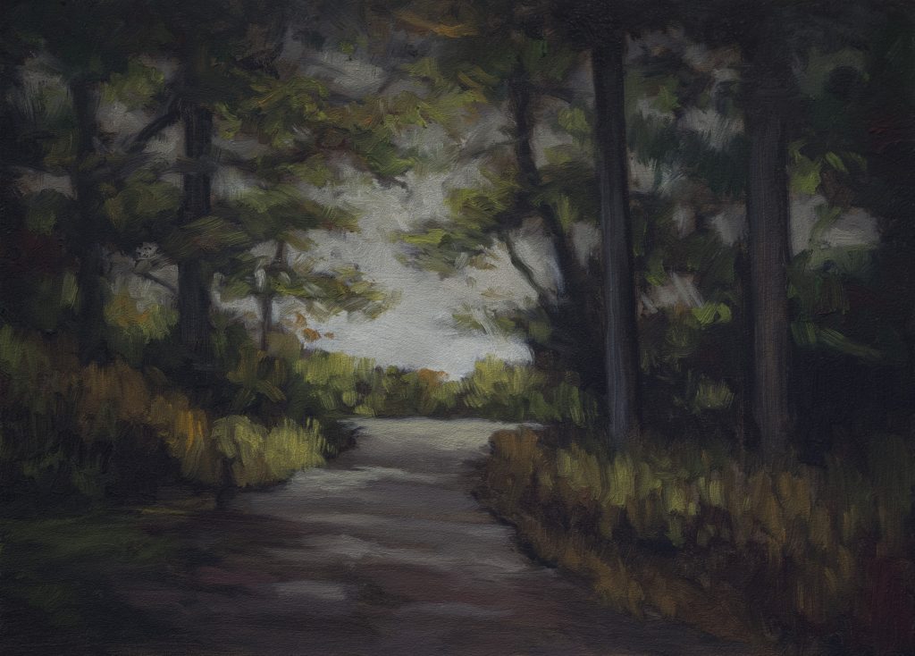
Drawing the Scene
The underpainting stage is where you can afford to mess up, most of it will get covered anyway. I’m working from a screenshot reference, but I’m already changing things. The path here is wider in the reference, but I’m narrowing it. The dappling effect is interesting, light spots over a darker tone, but I won’t worry too much about that now.
With forest scenes like this, what gives each one character is how the branches come together. I prefer fairly strong vertical trees rather than crooked ones. The big innovation I learned last year is not to define these shapes too much at this stage. The sky will help define them. We just need a rough idea of what we want.
[continues drawing]
I’m really happy with where this is at. The underpainting will support everything that comes after. Here’s the thing about the reference: you’ve got these silvery little peninsulas, rock formations, and there’s detail I’m going to completely ignore. I want them mostly dark. I don’t want a lot of focus on these. They could become a whole subject on their own. Always be closing, my friends. Always be closing. That means we’re always thinking about this hanging in someone’s home. Don’t get immobilized by the reference. There’s detail I could get involved with. Not going there.
Drawing’s done. Let’s mix some colors.
Color Mixing
For the sky, I’m starting with a blue-gray mixture, not pure blue, but something warmer. I don’t want the sky too dark since there’s a lot else going on.
Here’s my palette, left to right: titanium white, titanium buff, cadmium yellow, yellow ochre, Mars yellow, raw umber, Mike’s green (acrylic yellow mixed with ivory black), cadmium orange, cadmium red hue, cadmium red, burnt sienna, rose madder, burnt umber, perylene black/green, permanent green light, dioxazine purple, Persian blue, ivory black, Mike’s gray (ivory black with titanium white), and Mars black.
For the trees, I’m mixing a dark that leans slightly warm. I’ll bring in some Mike’s green, I quite like that combination. For the path, I’m using the underpainting color as a base, then lightening it with buff and a touch of warmth.
The key lesson here: Mars black and ivory black serve different purposes. Ivory black is excellent for mixing but poor for dark underpaintings. Mars black is more opaque and gives you coverage without streaking. But Mars black in mixtures tends to be extra ugly sometimes. You have to know when to use each one.
I don’t want to mix every color here. You want some colors to emerge organically as you paint. But we’re going to establish these transition colors now because we’re going from blue into orange. That’s a big jump. You’ve got to have a cushion, a color that gets on with both.
Painting the Composition
After lunch, I’m ready to paint. I want to make burnt sienna more opaque, so I’ll add Mars yellow. It shifts the color slightly lighter but gains opacity, a useful trick. You can compensate with a little more burnt umber if needed. The point is: don’t assume a color will work straight from the tube. Sometimes you need to adjust it.
The Sky
I’m starting with the sky using a Bristol Filbert brush. The reference is quite duotone, but I’m going to add more variation. I want to avoid a flat, unmodulated sky. Instead, I’m bringing in different tones, some warmer, some cooler, to create atmosphere and interest.
One thing that jumped out at me: I need to be careful about negative space. The composition needs breathing room, but not so much that it becomes distracting. That’s a balance you learn over time.
As I paint, I’m reminded that once you start making a painting, it develops a life of its own. You want to embrace that rather than impose your preconceived ideas too rigidly. The painting will tell you what it needs. You may have ideas about your painting, but once you start making it, it starts having a life of its own. And you want to embrace that. Don’t be so busy imposing your ideas of what it’s supposed to be over what’s happening in the present.
Building the Darks
Now I’m establishing the dark tree masses. The biggest evolution for me in painting forest scenes was learning to focus on shapes rather than draftsmanship. Make the shapes pleasing with variations in color and value. That’s far more effective than trying to render every detail.
I’m keeping my darks connected and avoiding the “Swiss cheese” effect of too many scattered sky holes. Where the trees meet the sky, I’m being intentional about transitions, not too distinct, but not muddy either. This is one of the most challenging things to master when you’re starting out: how your tree edges interact with the sky.
I’m also watching for the halo effect. If you do it too tight, you get that halo, and that’s the kiss of death. You don’t want that. But any strategy for addressing the tree edges coming in over the sky, modulation is one of the big keys.
Introducing Color
Now we’re getting actual color into the painting. I’m using dark greens and introducing some dark reds, counterintuitive perhaps, but it brings life to the shadows. The Mars black underpainting is a bit dead, but that’s a trade-off. The color will compensate.
You don’t need to use every color you mix. Sometimes I’ll mix something and then decide to use it differently than I planned. That’s fine. Keep some of those color patches on your palette, they might come in handy later and save you the time and trouble of mixing again, which could take up to a minute. And then instead of being in creator mode, you’re in “Matchy” mode, trying to recreate a color you already made.
The Path and Foreground
For the path, I’m using a warm yellow-ochre tone with hints of cadmium red for warmth. I’m not copying the reference exactly, the reference is just inspiration. You have agency as the artist. Take charge of your color choices.
I want to build the path with warmer, lighter tones. I want to avoid making it too bright or too uniform. The path should have variation, some areas darker and more subdued, others brighter and more saturated. This guides the viewer’s eye and creates visual interest.
I’m being careful about the halo effect where light meets dark. If your lightest bits come into the extremities, it always looks better than cutting a hole in the composition. Of course, even telling you that, a lot of times I look at my work later and say, well, it looks like you got holes there. But you’re always working toward something better.
Watch out for doing things too regularly. Break up the rhythm of shapes and spaces. You don’t want everything marching along in a predictable pattern. Vary it. That’s what keeps a painting alive.
Color Choices and Intuition
One thing I can do is just a few notes here. They don’t need to be a discriminate color. That’s why I just mixed in what I did. Don’t get carried away with this kind of thing, because you don’t want to lose your shapes.
There’s a color I’ve been envisioning for this transition. You could ask, “Mike, why didn’t you mix that?” Well, you don’t want to mix every color. You kind of just do the broad bits and let things emerge as you paint.
It takes a little while for you to get to know your brush. I can feel how much paint I have. A lot of times you see me make a move and nothing’s happening. I turn the brush over and then something happens because I know, I have a feeling for how much paint’s in there. That’s going to be based on experience with your brush.
Final Adjustments
As I near completion, I’m looking for sky holes that are too distracting. Instead of leaving them as pure sky, I’m filling some with a lighter tree color, still vague, still atmospheric, but less jarring.
I’m also watching for shapes that need softening or clarifying. The camera is helpful here, it shows you things your eye might miss. If you don’t have a camera, use a mirror. Looking in the camera, I do see some things that need adjusting. That’s always the case. Don’t get weird about interruptions either. Interruptions are good because they take your eyes away for a bit, and then a lot of times when you look back, you go, “Oh yeah, I need to go a little further with this or that.”
The trunk that goes off the top of the frame is slightly crooked, but that’s fine. Not everything needs to be perfect. The goal is to express yourself while you’re thinking clearly, while you’re alive and engaged. Don’t freeze up trying to achieve perfection. You don’t want to say your painting needs to be perfect. Just as good as you can make it in the moment, while you’re alive, you know? While you’re thinking about things, while you’re able to make it. You don’t want to freeze up. You want to express yourself. That’s the point.
The Real Payoff
This painting is nearly done. I’ve established the sky, the tree masses, the path, and the foreground. The fresh approach is always better than overworking. I want it to look like a painting, not a photograph.
I’m happy with all that. Do I think that I’m looking at this thing and it’s perfect? No. I’ve done enough paintings, I know that. The fresh thing is just better.
Thank you for watching. See you next time.
Mike New Site | The Book | Gallery | YouTube | Members Area | My Music