The Winding Way 6×8 – 15 Minute Painting Session!
The painting I’m bringing you today is called The Winding Way, 6×8. I really liked this painting and couldn’t wait to share it with you.
The Ground Color
Maybe you’ve noticed the tone of the board is not quite the same as the rich soil we’ve been doing for the last year. I had a project where I wanted a little more ochre, so I bought a pot of straight up ochre, which I tried doing some paintings on and they worked out okay. I didn’t quite love it. But what I did was bring some of the ochre into the rich soil and I really like this color because it’s a little more subdued than straight up ochre. I found the straight up ochre as a ground color was just too poppin’. I don’t want that.
The drawing is just straight up burnt umber. I didn’t mess around with it much and it looks nice on this color. The tree you see me drawing there was my main attraction.
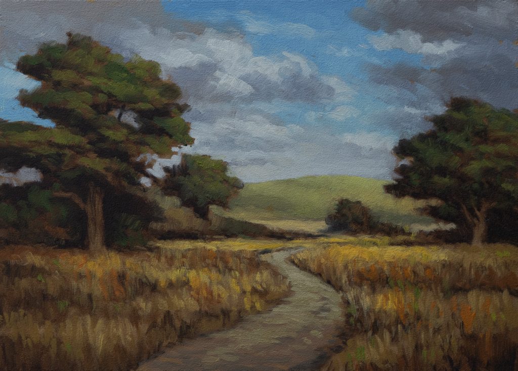
The Reference
The reference this is based on is a photo I took a long time ago, probably around 2011. I was out there doing plein air painting. This field had these kind of reddish weeds in it, and these trees were way back in the distance of that photo. I hung onto the photo even though I didn’t use it. The two groupings of trees were quite a bit further apart. They had the rolling hills in the back. They didn’t have the path. Uncle Mike installed that.
Yes, I can make a painting with just a field. But I’m going to want a path in it. I like a path. And there’s always challenges with painting the path.
What I do is basically cut out where I want the path and save it as a PNG file. Then I load it up and say, put a dirt path in here and don’t make it too busy. It gives me some reference. That’s a great use of that particular technology. Probably my primary use. The other thing is I didn’t want it overly contrasty—it’s a daytime scene.
Painting the Sky
Mostly blue sky with some little variations in the clouds. We’re talking about that quite a bit in the last few easel talks, so check those out if you want to get some insights into ways to enhance and amplify your color, so your paintings are more exciting and less boring.
The thing you really want with this kind of scene is for those rolling hills to almost seem like a part of the sky. That’s how you get that distant feeling. First, you don’t want too clean or hard of an edge. Also, you definitely want to be bringing those hills in in a value that’s not much different than the sky. Think of them as a part of the sky. That’s a great tip.
Here you see me modulating as we go down, and I am leaving room to go a bit brighter. One thing I used to do a lot was go very bright right up to the edge of whatever was breaking into the sky. Just a default. But these days I prefer to keep it a little more neutral and bring in my brightest tones in other places.
When I am using flats—and I don’t always use flats but when I do—I use the corner of the flats a lot. That’s the basis of a lot of what I do. With filberts it’s a little different. I’m using the bevel and the toe.
Don’t Overwork the Sky
We’ve got our sky in and I’m very happy with it. The thing is with skies, you don’t want to overdo any part of your painting but especially the sky. The more you start worrying things and working over things, the less you’ll get that feeling of water and air cooperating together to make a beautiful sky.
We want to see your brushstrokes. We want to see how you’re expressing yourself as you paint. That’s one of the main things that painting brings to bear that photography cannot and will not.
The Path
I decided to do the path because a lot of times paths will be similar tones. One of my pet peeves is you always have this bit of grass coming up through the middle of the paths. I might kind of indicate it in a way, but it’s not very often I’ll focus on that. I just want to have the paths looking disturbed and natural. If there’s no patch of grass going up the middle, that doesn’t say modern. Here it’s a path that could just be a footpath.
The Grass
I’m very happy with the way the grass turned out here. In the reference it was a little more green. I will almost always have a tendency to make grasses more yellow because it’s just a great way to differentiate from the trees. I’m going to pass that tip along.
One of the challenges here was how am I going to resolve where the path is ending up. I don’t always try and solve those problems with draftsmanship because the camera would have given me quite a wide angle and things are real tiny back there. You want to move things around. Also there’ll be way more detail and clutter. You need to simplify things in pretty much every aspect of your painting.
Even if it looks to people like it might be complex, that’s good in my opinion because I’ve simplified things dramatically. What’s giving people the impression of complexity or detail is usually just my brushwork, which is almost always loose and fractured. I lay down stuff and I try my best to leave it alone.
Let the brushwork tell the story. Let the brushwork feel like detail. That’s what looks nice.
When to Leave Things Out
One thing I will point out: the reference’s distant hill had little trees on it. Maybe if I was painting this quite a bit larger I might paint one of those little trees on there, but especially there was a tree breaking into the sky. That becomes a real focal point of its own and I didn’t want it. I just painted the rolling hills alone, which gives us a nice light, interesting place to go to. If you got these hills in the distance with the little trees on them, you’re thinking I gotta paint those, they’re really there. Nah, you don’t. Voice of experience here trying to school you, okay?
The Red Field
You can see I’m coming with the red, and this was the thing about the field—there were these striations of reddish weeds. I don’t know why they were kind of in a striated way, but I decided to work with that. The red I’m using is quite an earthy red, mostly mixed with probably burnt sienna and amplified with my mixing red, which is that Winton cad red hue. Maybe a little orange.
Recession and Depth
We did that tan in the distance, which was definitely inspired by the reference itself—an area of dry grass going up the hills. I didn’t worry too much about it, but I did think it was cool that we had some place to head towards. Then I supported it with that brighter bit of more yellowy grass, which is helping to give us a lot of recession.
This painting feels pretty good size even though it’s only a little 6×8. I had to do a lot of things to manipulate that original photo. I moved the trees closer together and messed around with it a little bit. I’m really happy I did because it does a good job of capturing some of the more rural beauty you get out here in New Zealand. This is the kind of landscape that appealed to me most when I first came out to New Zealand.
Hold Onto Your Reference Photos
That’s one of the reasons you want to hang on to those reference photos you took that maybe didn’t work but there was something in the landscape that was speaking to you. These days with just a little bit of tweaking on the digital tools—and I know a lot of you just don’t want to mess with those—but if you do, it can really pay off big time. Painting isn’t that easy to do. It’s rewarding, but you can use these tools to really increase your chances of doing something good. Every technique I use and bring to bear on my reference images is brought to bear on both the good and bad paintings. I just want every advantage I can have, and starting with something inspiring and attractive is definitely a huge advantage.
Don’t Overwork Your Grass
Don’t overwork your grass. Try and stay away from lots of little tiny thin strokes. You’ll notice I use the brush in all sorts of different directions there, and I got a good result. You should get a sense of that striated feel that was attracting me to painting the field in the first place.
That’s it for today’s video. Take good care of yourself, your family, all your loved ones. Stay out of trouble and fight the power.
Take good care of yourself. Stay out of trouble. And fight the power.
Mike’s New Site | Substack | Painting Website | Mailing List | Store | My Music | Support | Members Area
M Francis McCarthy, Your Painter in Residence