Light Through the Trees 5×7 – Live Painting Session!
I’m creating a tonalist painting based on a California landscape reference I took almost 20 years ago. The original photo captured early morning light filtering through an oak forest, and I’ve simplified the complex scene to focus on what matters, light, shadow, and atmosphere.
Transcript and Key Insights
The reference has a confusing tree placement right on either side of the path, so I’m opening up that area to improve readability. A busy, complex scene needs simplification. This is a five by seven, which felt right for today. The painting will work as a five by seven even though the reference might be a four by six. You just visually squeeze the composition to fit the new proportions.
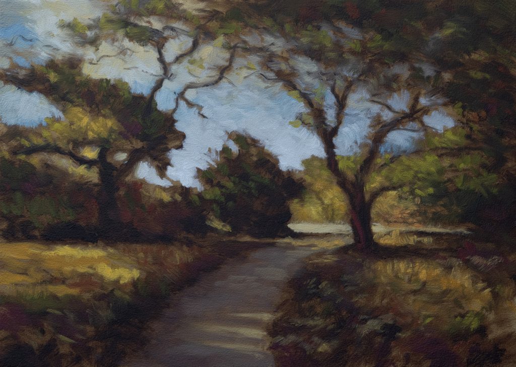
One key decision: pulling the tree over from where it sits in the reference. There’s a lot more going on in the reference than what ends up on the canvas, but simplifications are a friend. I’ve got roughly 10 branches coming up from one vertical trunk, but I’ve simplified it to three and added one more.
The Underpainting
I’m starting with a rich, dark underpainting using Mars black and ivory black mixed together. This gives me opacity and dimension right from the start. The board is oiled out, and I’ve established a horizon line with my T-square, though we won’t see much of it in the final painting.
My drawing indicates where the trees, path, and light will be. The key is keeping the drawing simple so it guides rather than constrains the painting process.
Mixing the Sky
The sky has a little blue in it, but I’m not after a screaming blue. I’m using raw umber with the blue to create a muted tone, you can see how green that mixture gets initially. To counteract the green, I’m adding cad red hue (the mixing red), which removes the unwanted color cast and gives me a good, natural blue.
For the sky itself, I’m mixing both cool and warm grays. I want the light to feel cool down in the lower part of the sky, but I also want glowing warmth up above. It’s an early morning in the woods kind of scene, and that requires both temperatures working together.
Building the Green Palette
I’m mixing three greens for this painting. The darkest green starts with perylene black, it creates a beautiful cool green that feels natural. But that’s too cool for this painting, so I’m bringing it into warmer territory with burnt sienna. That gives me a rich, dark green with real presence.
For the middle green, I’m introducing orange and quite a bit more burnt sienna. This is the workhorse green, it’s warm and natural-looking without being garish.
The lightest green is tempered with raw umber, keeping it earthy and believable. The great thing about Mars yellow is that it doesn’t chalk things up too much, unlike yellow ochre, which has a chalky feeling. In the lighter areas, that chalkiness matters less, but I’m still mindful of it.
The Path and Ground
The path color is close to what’s already in my ground layer, so I’m just adding a few accent notes. It’s not my typical rich soil brown, I’ve mixed in some yellow to warm it slightly. I also mixed a gray-brown for areas where the path catches less light.
For the darkest passages, I’m after a super burnt sienna tone, not a purple-red. Getting the right color temperature in the shadows matters as much as getting the highlights right.
Painting Process
I start with the sky, laying in my blues and grays with a larger brush. The darks come in next, establishing the deep shadows under the trees. Then comes the foliage, I’m using a new filbert brush for the foliage work, which handles the organic shapes beautifully.
One thing I discovered at lunch: when a brush is stubby, it actively removes paint rather than just applying it. That matters less during the underpainting, but once you’re working over existing paint, a short brush can create texture or reveal underlying layers in ways you didn’t expect.
I’m working from dark to light, but I’m also reserving my brightest lights, the dappled areas where sun breaks through the trees. These catch lights are what make the painting sing. There’s a spot where light doesn’t quite come all the way up, leaving just a little brightness in the shadow. That’s very moody and atmospheric.
The Painting Comes Together
The ground color is so close to what’s already mixed that I’m really just adding a few accents here and there. I’m using that darker purple-red tone sparingly, just enough to suggest form and shadow without overwhelming the composition.
By the time I’m layering the greens over the darks, the painting starts to breathe. The brushwork needs to stay loose enough that it doesn’t get too strokey or labored. If you find yourself hunting to do something, that’s usually a sign you’re done.
A final balance check: I’ve got two limbs coming in from one side, so I add another accent on the opposite side to even it out. Not too much, just enough to feel intentional rather than accidental.
The California landscape has always drawn me. I grew up there, and it’s the landscape of home. I didn’t get to paint as much of it as I would have liked before leaving, so being able to work from my own reference feels meaningful. Small paintings might not get the same credence as larger work, but to me, a painting is a painting. The size doesn’t determine the quality of the vision or the problem-solving required to make it real.
Take good care of yourself. Stay out of trouble. And fight the power.
Mike’s New Site | Substack | Painting Website | Mailing List | Store | My Music | Support | Members Area
M Francis McCarthy, Your Painter in Residence