Woodland Passage 6×8 – 15 min Painting Session!
Transcript and Key Insights
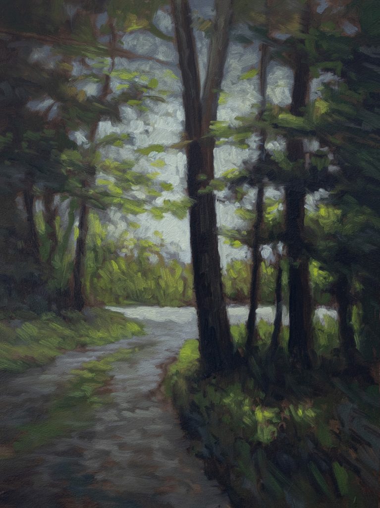
The painting I’m bringing you today is called Woodland Passage. It’s six by eight inches; I painted this a couple of days ago and I really like it. Hopefully, you will too.
What attracted me to this scene was the contrast, the light against the darks. That is one of the subjects I am consistently pursuing. Often, that subject itself is elusive. Is the light the subject, or is the contrast itself? It doesn’t matter much; the result is what counts.
I remember coming to the studio without a clear intent, unlike many days where I know exactly what size or scene I want to tackle, I didn’t have that certainty. I spent some time looking through my folder marked “forest,” which contains scenes I’ve prepared at home recently. While I often think, “Oh, I just did a certain type of scene yesterday and it turned out pretty well,” in actuality, the biggest determining factor in the success of any painting is usually the reference itself. You can take an amazing bit of reference and turn out a mediocre painting; conversely, you can take a mediocre bit of reference and turn out a great one. But your odds are definitely increased if you have reference that is inspiring and sound compositionally.
Now, it may not be 100% compositionally sound, we’ve talked about this in the Easel Talks, but having that foundational strength helps immensely. This latest talk was actually based on the idea that there is nothing new in painting except “you.” Since we are all new every day and no one else will ever be exactly like anyone else, that newness exists inherently.
The “Super Burnt Umber” Mix
Anyway, here we are into the underpainting. I’m using what I call my “super Burnt Umber” mix. It consists mainly of Burnt Umber, but I’ve added a touch of Mars Black and some Rose Madder to prettify it.
My approach to the sky is always very similar with this type of scene. Even though I’ve done this many times, it remains a challenge: painting all those leaves, trunks, and details against a brighter background. We know the sky should always be the brightest part of any painting; generally I wouldn’t make many exceptions to that rule.
In this reference, the sky was actually a bit sickly greenish. While I tried to get everything looking awesome in my reference image, certain things were hard to reconcile. So, I didn’t worry about replicating that exact hue; instead, I ensured I painted it as something else entirely. I also faced the typical wide-angle lens problem where roads at the bottom of the image appear incredibly wide. I narrowed the road significantly in my painting. Additionally, one of my main trees, the one splitting off at the top, had a weird angle in the reference. To fix this, I composited in some shrubbery down in that lower corner. As a bonus, that shrubbery came with a little highlight area.
You don’t need to worry too much about the mechanics of how that works in real life. Light bounces around; you can put a random shadow or a patch of light wherever it works for your composition. Unless it looks odd, people generally won’t question it. If people are asking questions about your painting, that is a “fail”, but failing sometimes is just part of the process. I fail all the time, and while winning feels better, that isn’t how the world works. We paint regardless.
Handling a Sea of Green
This piece is all about green, it is very, green on green. Dealing with a preponderance of green is a huge factor for landscape painters. My strategy here was to do my premixes carefully: a dark green, a dark red, a medium green, and a medium red. Note that these reds are quite subtle; they are reddish rather than outright red. Having these premixes on hand reminds you not to just plow through with endless greens, which ultimately becomes boring. You have to modify things and change them up.
One of my other strategies is bringing in cool grays. I recall doing that in a few sections, especially down below in the grassy area; it was a big help in breaking up the greens. There aren’t unlimited ways to deal with greens, but you definitely have options: bring in reds, browns, or grays. You simply have to decide case-by-case which route is best.
That uncertainty puts you right in the moment as you are painting. Note, what I’m doing with that big brush right now isn’t so much painting as softening things. You can definitely tell I’m getting ready for the final elements to go in. Sometimes I use a fresh big brush, and sometimes I’ll just use a brush already used in the painting process, just making sure it’s wiped off well. It’s almost never a problem to adjust edges this way if you’re using a brush that was used for dark colors.
In this specific road, I want to point out that I’m not generally a big fan of painting grass growing up the middle of roads or trails, because modern vehicles have wheels this is common in most reference images. Here, the grass in the road had a certain charm to it, so I brought the greens right up the middle. It really helped; otherwise, that area might have been a “null zone”, a boring spot where the viewer’s eye would lose interest. Every painting will have areas like that. When I’m painting those seemingly empty spots, I often refer to it as “painting nothing.” Just look at that bottom bit of shrubbery I installed; how it actually ended up with a highlight became one of the things strengthening the painting.
Working with Dappled Light
The biggest challenge here is the dappling, the light coming through the leaves creating patterns of shapes against the light. Because of all that contrast, those shapes take on a lot more gravitas and need to be worked out carefully. At one point, I was looking at the three masses or clumps of foliage coming in over the sky on our right. The lowest one on our needed some adjusting to break up the pattern, so I knocked in a little bit more light color there.
Finally, here is an important tip for you. If you have bright leaves and a bright sky, one has to predominate. One has to be brighter than the other. Here, I pushed things a bit brighter on the sky side. If you don’t make a decision like that, you end up with a “war in your hands.” It creates confusion, which makes the painting less enjoyable for the viewer.
Conclusion
I hope you enjoyed watching this demonstration. I’ll be back real soon with another one for your edification and enjoyment.
Take good care of yourself. Stay out of trouble. And fight the power.
Mike’s New Site | Substack | Painting Website | Mailing List | Store | My Music | Support | Members Area
M Francis McCarthy, Your Painter in Residence