The Quite Passage 6×8 – Live Painting Session!
Transcript and Key Insights
We’re going to make a painting today. I’ve got my colors pre-mixed, and we’re starting fresh with the drawing because the camera wasn’t focused on the first attempt.
The Reference and Setup
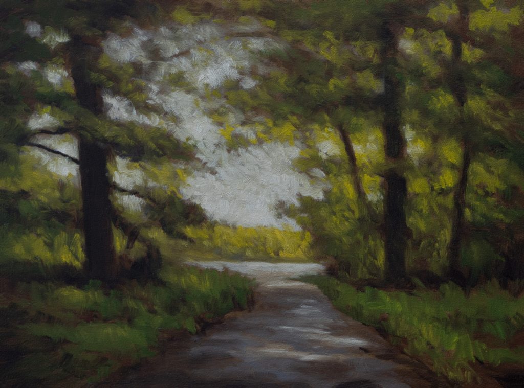
This reference comes from a folder I keep of forest scenes, it’s clearly my favorite type of scene. It’s mostly sky at the top, which is interesting because most of that sky will actually be covered with foliage. The real subject here is the light coming through the trees, not the sky itself.
I’m working on a 6×8 board. Originally I composited this as a 3.5×5, but it came out looking good enough that I decided to open it up. Six by eight gives me room to do some cooler things. Not that you can’t work with a 3.5×5, but it’s definitely harder.
Key Insight: Sky Isn’t Always Sky
Here’s something I’ve been working through: when you’re looking at a forest scene like this, the sky might be unencumbered at the top, but the majority of it will be interrupted by foliage. Even where you see sky, you can swap some of that out for sunlight hitting the trees.
This means you don’t need to commit to a traditional sky treatment. You can use dashes of color, break things up. It doesn’t have to be with foliage color, it can be with a darker version of the sky itself. You want to say you can do some dishes and dashes and things like that, break things up.
That’s been a very helpful insight for me as a painter. I’m still working on it, but it changes how you approach these forest scenes.
Color Mixing Strategy: The Greens Problem
The greens in the reference are quite dominant. I’ve developed a technique for moving and modifying very green references. If you’re using Photoshop or Affinity, use the color balance tool. It has three settings: midtones, highlights, and shadows.
Push the shadows bluer. Push the midtones redder. Push the highlights more yellow. That’s a good way to move the painting out of being purely green and opens things up.
For the actual mixing on the palette, I’m starting with Mars Black and adding Perylene to create a cool dark green. Now I know how cool Perylene is, so this is going to be overall a warm painting, and I still need more adulteration.
I’m going to bring in some of my mixing red, that’s Winton. It’s subtle and it’s muddying it a bit, but that muddiness is going to be a desirable trait. It gives the green complexity and warmth.
Here’s the big technique: use the alternating green and red trick. Don’t just lay down greens. Alternate with reds. I want to have the ability to break things up and move things around. This is a big secret to dealing with your greens. Alternate. Alternate.
For lighter greens, I’m bringing in Mars Yellow. That’s an actual green tone. I need to bring in some warmth. This whole painting is warm, so even my greens have warmth built into them.
I also use Indian Yellow sometimes, very strong color, not usually on my palette. But it’s good to not have infinite colors on your palette. The extra warmth it’s giving us is valuable.
Painting the Sky and Light
The thing that makes a whole painting work is where I get some color in there and the light from the sky. I’m not even going to mess with blue in the sky. This is going to be sunlight and not sky.
I’m starting with a light gray made from black and white, but I don’t want it too dark. I’m bringing in some Burnt Umber and a little more cleanness with Yellow Ochre. That gives me a yellowy, bluey, sky-type tone. It could go brighter, but I’m holding back.
Even up here in the sky area, I’ll probably swap some of that out for sunlight. It’s very subtle. You can do some dishes and dashes and things like that, break things up. It doesn’t have to be with a foliage color.
The Path and Light Structure
The brightest parts, the sunlight hitting the path, should never be brighter than your sky. That’s a hard rule. Nothing should be brighter than the sky itself.
The path is mostly orange, sunlight yellow. I’m keeping it stepping down in value. If at any point the path becomes brighter or more intense than the sky, I’ll take the sky a notch brighter to maintain that relationship.
The dark areas in the reference aren’t that strong, so I’m keeping them restrained. Normally I’d be dark in the corners. That’s my default. But here, I’m not defaulting to that. The light structure is more important than heavy shadows.
Common Mistakes to Avoid
Don’t let your greens take over the painting. If you only use greens, even well-mixed ones, the painting becomes one-note. Use the alternating red and green technique to pulse interest through the composition.
Don’t make things brighter than the sky. It breaks the logic of light in the scene. You need a hierarchy of brightness, and the sky or sunlit sky areas set that ceiling.
Don’t treat the sky as a flat shape. You can break it up, interrupt it, add warmth and color variation. It doesn’t have to be uniform.
The Working Process
I’m not overthinking this as I paint. I’m letting the painting tell me what it needs. I started with the sky, moved to the path, and now I’m bringing in the greens and reds that hold everything together.
The board color, a little more golden than usual, is supporting the warmth I want. I’m enjoying painting on this surface. It’s different from my typical board color, and the extra warmth is helping.
I’m using a Silver Grand Prix filbert, size 1. For the highlights and lighter passages, I’m careful not to make them more intense than the sky. The brush choice matters because I need control and the ability to shift between broader strokes and more delicate work.
Why This Matters
What we’re doing here is real. It’s one-of-a-kind, non-repeatable. My hand, my consciousness inhabiting a body in real time, on a real board. That’s intrinsically valuable because it’s an expression of the universe in the present moment.
The techniques matter because they serve that expression. Modulation, alternating colors, restraint with brightness, these aren’t rules for their own sake. They’re tools that let the light and feeling come through.
I come up in a world where artists like George Inness changed things. Those coming along after, watching these videos, will be standing on my shoulders. That’s how it works. You’re not claiming to be better. You’re standing on the shoulders of giants and doing your own thing from there.
Take good care of yourself. Stay out of trouble. And fight the power.
Mike’s New Site | Substack | Painting Website | Mailing List | Store | My Music | Support | Members Area
M Francis McCarthy, Your Painter in Residence