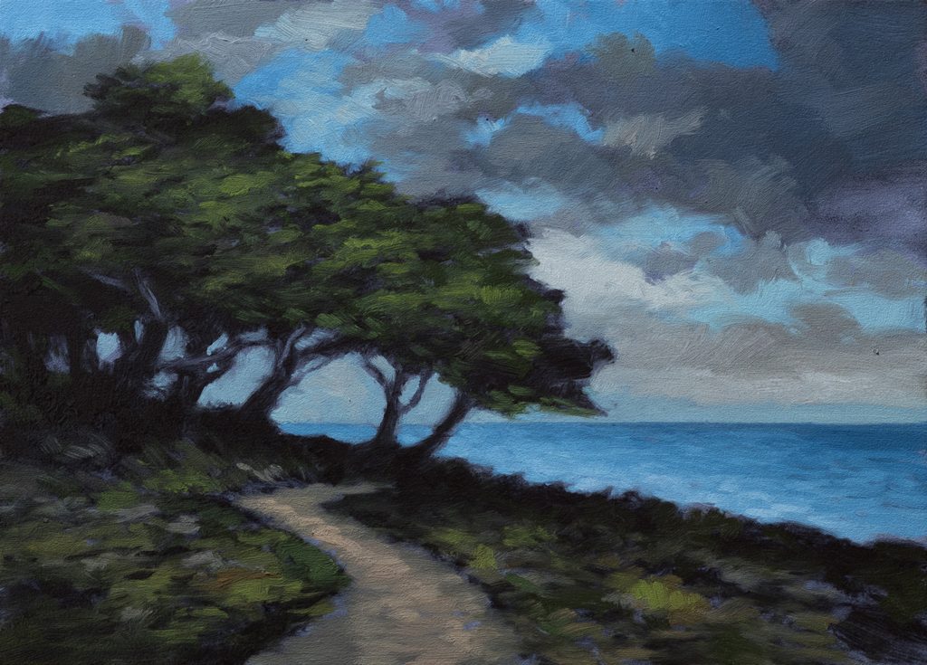
Coastal Cypress – Evening 5×7 – Live Painting Session!
Transcript and Key Insights
I’m doing a cool scene today, so I’m starting with an underpainting color. Black on its own can feel a little ugly, so I’m mixing Prussian blu, which is quite transparent, with black to create a blue-black. Ivory black would work, but it’s such a slow dryer that when I go in to do the actual painting, the oil can delaminate the underpainting. That’s not a permanence issue; ivory black just takes a long time to cure. By using Prussian blue instead, I get the depth I want without that risk.
The underpainting is still reading quite green, but that’s okay. I don’t mind that at this stage. It’ll work fine for what’s coming next. We’re working five by seven again, the scene works perfectly at that proportion, and the camera is already set up for it.
Drawing the Composition
Now I’m moving into the line drawing phase. I’m working loosely based on a reference image that was inspired by Isaac Levitan’s work, though I’ve modified it significantly. I took the reference through a process with assistants where I started messing with the original, changing things. He didn’t have an ocean in his, so I ended up with something really rough that I liked. Then I took it to another assistant and had it made into something more photo-real, not that this looks like a real photo, but it’s just part of my process.
The reference has a lot of detail and odd, inspired things about it, but once you start painting, there are so many variables that elements from the reference won’t make it into the final piece anyway. The reference isn’t helping me out much here, so I’m going to deviate from it quite a bit. I did put a path in, and the path is okay, it’s just okay. We’re going to deviate from it a bit more.
I’m starting with the cypress trees, there’s going to be a lot of trunks in this composition. The horizon is lower than I initially sketched, which is pretty typical. I often have to adjust that as I go. It’s par for the course. I’m also opening up the composition considerably; it was pretty much all silhouette at first, but now there’s more variation in value and shape.
The abstraction is critical here. I don’t put down abstract art, but I think it’s actually very difficult to do good abstract art. Right now, I’m just blocking in the major shapes and values, I don’t have to figure out every bit of everything at this stage.
Building the Palette
After lunch, I’m ready to start painting. I’m using a size three flat brush, which is perfect for what we’re doing. It’s nice and works well for this scale. Let me walk you through the colors I’m mixing.
For the sky, I’m starting with black and light blue. I need a lot more blu, I can tell you that right now. I want to add a tiny bit of red to counteract the greenness. You see how it looks pure now, but without that red adjustment, it would be a bit on the green side. Both my light sky and dark sky are reading a little more pure than I might want them to be, but we’ll work with that.
For the clouds, I’m using just a tiny amount of blue. It looks pretty dang good. Now I’m mixing a warm gray. I started with burnt number but immediately counteracted it with blue and then black. A little purple could go a long way her, I’m thinking about where I want to go with the warmth. It’s going to be ending up to look like a lot of purple, but let’s see. Oh, it’s a lot of purple. I’m not seeing a color even. I’m not seeing purple in the reference, and you probably aren’t either, but I’m thinking of where I want to go with the warmth. We’ll just keep stepping it down. That will work very nicely. Instead of like a brown color, we’re going to go with that warm tone.
For the foliage and trees, I’m going to lean heavily into perylene action and not use a lot of reds. There would be some reds salted around in the painting, no question, but perylene is going to be the dominant green. I want that light green, notice how I took the mix aside when it went a direction I didn’t want, and then brought it back. Otherwise, you end up with giant piles of paint. If you feel like you’ve got mixed up too much paint that’s gone the direction that’s a little far from where you want to be, that’s what you do. You set it aside and bring it back.
That light green, that’s beauty. That’s pretty good just the way it is. We can go lighter and brighter later. For the path, I’m throwing down a gray. It’s not much lighter than what’s around it, but it doesn’t matter. It’ll work out fine, and I can make it lighter and darker as we paint.
I’m starting to get used to this burnt sienna from the Georgian, both are oxide-based, but this one’s lighter. It does the burnt sienna job I need for mixing those warm grays and earth tones.
Painting the Sky
The sky is looking nice now. I could see a bunch of things I could work on to fix, but I’m hesitant to because I like it just the way it is. You know, everything you do, you’re taking a chance at a certain point. Like after something’s done like that and you think you’re going to improve it, yeah, maybe you will, but sometimes you just end up messing it up. I wait for something that jumps out, something that really needs a big fix. That’s what I look for.
I’m not going to do too much with the sky now. It’s darker, and I’m satisfied with it. I could see a few things in the referenc, there was a big bunch of bright white up at the top, but I usually don’t like to do that. It’s too distractive. I don’t mind putting it up against the main trees though. The lesson there, of course, is that you can take inspiration from one part of your painting and move it to another. That’s how you solve compositional problems sometimes.
I’m liking the sky chunky in a good way. I don’t want to overdo it.
Painting the Trees and Foliage
I’ve got my brush for my darks now, and I’m pretty happy with the trees. They’re all situated, and getting them in was a challenge. The big solutions have been working for me all year, you do your best to get it in roughly, but don’t worry about perfecting everything right away. We’re pretty dark already, which is good.
Now I’m moving into the foliage. It’s a tricky thing with the greens and the darks, you’ve got to balance them so they work together. I want to make sure the trees read as trees and don’t just become one dark blob. I’m making subtle changes in value and tone within the foliage mass to create depth and interest.
I’ve topped up the oil now. I want the trees to have that dimensional quality, some areas darker, some with a bit more life in them. I’m being thoughtful about where the light is hitting and where it’s falling into shadow.
The Ocean and Final Details
Now I’m moving into the ocean. I don’t want to get too aqua or too shown, so I’m making it a pure sort of blu, well, not pure, but a deep blue that won’t be too bright or too shallow-looking. I’m thinking about the water as a separate element that needs to anchor the composition.
I’m mixing a color that needs to be a reddish gray, maybe a little purpley. That wouldn’t look good in a tree, but we can start with it and see what we get. The ocean needs some warmth in it to tie it to the rest of the painting, otherwise it’ll feel disconnected.
For the path through the grass, I’m using that warm gray tone. Kind of like the board color itself, it’s subtle and doesn’t fight with the dominant greens and darks of the composition.
We’re pretty much done. I’m going to do a little bit of smoothing, come in with some more blacks for any final depth adjustments, and then a little more smoothing. I think we’re finished.
Take good care of yourself. Stay out of trouble. And fight the power.
Mike’s New Site | Substack | Painting Website | Mailing List | Store | My Music | Support | Members Area
M Francis McCarthy, Your Painter in Residence