Hole in the Rock 7×14 – 15 Min Painting Session!
Transcript &Key Insights
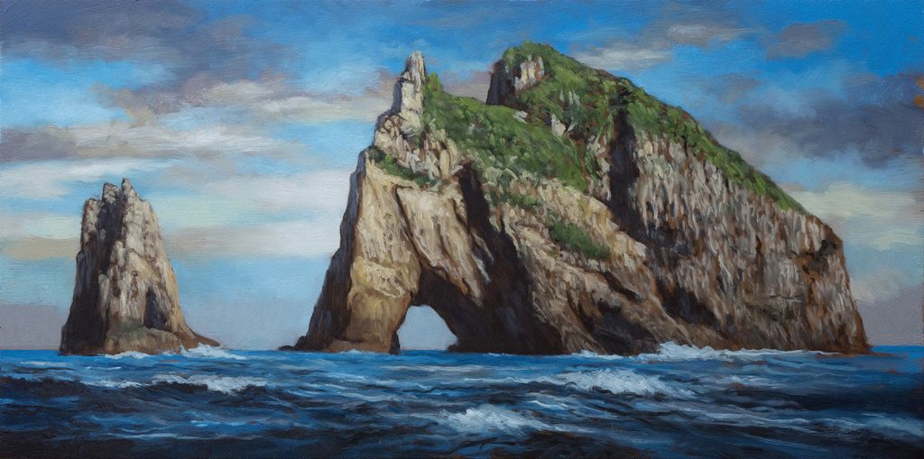
Today I am sharing a painting called “The Hole in the Rock.” It is a 7×14 piece that I completed last week, and I am super happy to share it with you. We have painted this scene before, one of my three big paintings from last year alongside Whangarei Heads and Poor Knight’s Island, but I suspect I never shared that specific version on the channel. This new iteration includes a smaller island nearby that was missing from the previous attempt, this rock formation has a look like a creature about to pounce. It is an incredible locale, and I am proud of how this commission came together.
Preparing the Board and Grid System
To get started, we begin with our underpainting on a board that has been prepped with our typical rich soil or deep earth tone. For this painting, I used my more extensive grid rather than my standard method. Since I am not particularly into math, the process is simple: in my photo program, I just use the percentages in the document ruler to create lines at 50%, 25%, and 75%. This essentially divides the board in half and then halves those sections again.
While the digital grid relies on these simple ruler markings, drawing the actual lights onto the physical board does require a little calculation to find midpoints. However, the more extensive grid helps us find our bearings much easier when setting up the composition. It allows for more precise placement of key elements without needing complex geometric calculations during the painting process.
Approach to the Sky
When working on the sky, I had some interesting compositional choices to make. I really wanted to stick to a blue theme because the time of day is clearly not sunset or dawn; it is midday on the eastern coast of New Zealand. While a massive amount of intensely colored sky would have been unsupported by the lighting conditions, I did manage to slip some color into the clouds.
You might be surprised how much you can get away with in a typical blue sky by featuring taupe tones. Also, you can move grays into purples and even introduce pinks. From a painter’s standpoint, a pure blue sky with white fluffy clouds can sometimes feel a bit boring. To combat this, I used my trademark bright bit of cloud up against the landmass. I am big on doing this because placing your brightest element in the sky against the land creates the area of highest contrast. This reinforces the fact that the vertical landmasses, in this case, the giant rock with a hole in it, are always going to be the subject of the painting.
Structural Method and Landforms
I knew early on that the landforms would require the most time in this painting. I am quite happy with the drawing stage; I got all the basic facts in place without becoming overly detailed, which prevents the final result from looking too tight or boring. This approach differs from how I paint a forest path. In a forest scene, I might be less concerned with accurate placement and more focused on conveying the feeling, quality of light, and air. Here, however, my goal was to convey the facts of the local in a loose, expressive way that prioritizes the impression of the scene over specific small details.
To manage this effectively, I structured the painting into distinct phases spread over several days. First, I did the drawing one morning. Then, I came back to do the sky that afternoon. The next day, I tackled the landforms. This methodical approach allows for fresh results in each section. By dividing the process up, sky, then landforms, then ocean, I ensured that everything looked good and remained fresh as I moved through the painting. While five hours is the actual time spent putting paint on the board, there is also significant effort involved in gathering reference, preparing my mindset, and setting up the studio.
Working with Darks and Board Color
Once the darks were in place, I began moving into other tones using my pre-mixed colors. One key aspect of this painting is how the underlying board color supports the work. There is a lot of that warm, brownish earth tone peeking through around the edges of the strokes. If you were just looking at the reference and putting one foot in front of the other, you might be tempted to paint the darkest areas extremely cool. I did use a coolish black (mixed with Mars Black, but there is an awful lot of warm brown glowing through from the underlayer.
Having these shadows retain warmth was very effective for the overall feel of the painting. It added depth and prevented the dark areas from looking flat or dead. This interaction between the pre-mixed cool colors and the warm ground color underneath really helped support the visual structure of the rock formations.
Highlights and Textural Details
When introducing the highlight color, which is basically a light tan, I accomplished about 90% of the work in terms of conveying detail across this landscape. If you zoom in on the final piece, you will notice that it is not done in a precious or overly careful way; it consists of daubs of paint where I moved along rather quickly, putting down my idea of what was appropriate and then moving to another section.
There were specific sections, like the greens, where I had all the base colors in but came back with a lighter tone just to add more variation. I had to blend these strokes out carefully, but the added variation made the foliage look much more effective and lively. This quick, expressive application of highlights helps maintain the loose feel of the painting while still providing enough information for the viewer’s eye to understand the texture and form of the rocks and vegetation.
Painting the Ocean and Wave Tips
I came back on a new day to work on the ocean, which I love painting despite not being on the water frequently myself. I enjoy the excitement and drama it brings to a composition. My original reference image had a very still ocean, so I had to composite in elements from other references to add movement. Like with the landforms, I started with the darkest areas, mixing Mars black with some Prussian blue, followed by the next darkest blues.
One technique I employed here is adding a certain amount of neutral gray in the water to move things around and change up the overall coloration. Nature is never truly monochromatic or duochromatic; even if a reference looks like it is just blue, there are always other colors at play. Adding the neutral gray helped make the scene look proper and sensible after you start layering in the other hues.
Finally, I want to share a crucial tip regarding waves. In many references, waves appear blown out as 100% white. Do not paint them that way. Never paint your waves brighter than anything in the sky. The sky needs to remain the brightest element in your landscape to maintain proper atmospheric perspective and visual hierarchy. If you decide to make an exception to this rule, you had better have a really good reason for doing so. Keeping the sky as the light source anchor ensures that the drama of the water supports rather than competes with the overall lighting of the scene.
Thank you so much for joining me! I hope you enjoyed watching me put this together. Take good care of yourself. Stay out of trouble. And fight the power!
Mike’s New Site | Substack | Painting Website | Mailing List | Store | My Music | Support | Members Area
M Francis McCarthy, Your Painter in Residence