Dusk’s Ember – Full Live Painting Session!
Live Painting Transcript and Key Insights
We did a version of this yesterday on the gray. Perfectly saleable. Smaller. But I’ve changed the scene quite a bit with some help from my assistants. You’ll see some synthetic color mixing here. Grist for the mill. That’s how we roll.
One of the main issues I struggled with yesterday was transparency in the ivory black. I thought, “I don’t need the Mars black.” The painting’s quite nice, I’m not complaining. But the underpainting color—it’s not so much brown as black with brown—and when it’s that dark, the ivory black just doesn’t give you the coverage you need. It streaks. It shows through where you don’t want it showing through.
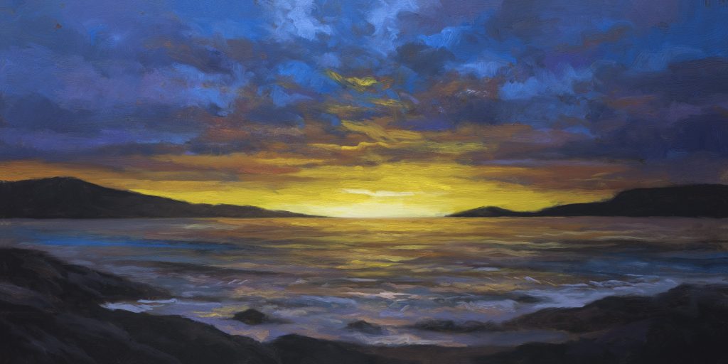
Yesterday I had gray peeking around the peninsulas, between the rock shapes and the orange. That gray was too light. It called attention to itself. Problem. So today we’re switching to Mars black. Mars black is more opaque. It dries. It gives you coverage without the transparency issues.
I showed a friend of mine yesterday’s painting. I’m quite proud of it. Beautiful stormy blue sky with a golden horizon. He said, “That’s ominous.” My assistant called it “apocalyptic.” I wasn’t thinking apocalyptic, but I guess it is. The painting works either way.
The Underpainting
It’s 10:30 Wednesday, March 18th.
The underpainting color is not pure brown. It’s black with brown. A little matter in there, maybe verging on purple. When the color’s this dark, you can sense it. It’ll look even better on the painting.
I’m pretty happy with where this is at. The underpainting will support everything that comes after.
Here’s the thing about the reference: you’ve got these silvery little peninsulas, rock formations, and there’s detail I’m going to completely ignore. I want them mostly dark. I don’t want a lot of focus on these. They could become a whole subject on their own. Don’t want that.
Always be closing, my friends. Always be closing. That means we’re always thinking about this hanging in someone’s home. Don’t get immobilized by the reference. There’s detail I could get involved with. Not going there.
One thing about yesterday’s painting that doesn’t work as well: I made the whole ocean bit just orange. But there are going to be waves here. There’s going to be activity. There’s going to be color variation. That’s more interesting.
Understanding Yesterday’s Failure
Yesterday’s was a five by ten. It looked cool, but there was a few issues, some palces where I failed
The thing about failures is: your successes are built on your failures. You have to understand that. The streaking issue with the gray, the problems with coverage, those are lessons. Next time, I know to use Mars black for the underpainting. I know to close up the composition. That’s how you get better.
Color Mixing
Thursday, March 19th. The underpainting is bone dry.
We’re in color mixing mode. We need a lot of blue. We’re going to take at least half of this and make it a lighter blue. Now we’re breaking out the Cadmium. Cad will be a player here.
What’s on the palette: titanium white, titanium buff, Cadmium yellow, yellow ochre, Mars yellow, raw umber, Mike’s green, Cadmium orange, Cadmium red, burnt sienna, rose matter, burnt umber, perylene black, permanent green light, dioxazine purple, Persian blue.
I’ve got a fairly synthetic reference. It’s based on manipulated coastal scenes from postcards. Those images tend to look synthetic—where the waves are tinted violet because the photographer had a filter on the camera. You don’t want it to be too fake or false looking. But you can use that synthetic quality as a starting point and make it your own.
Here’s a big lesson I learned yesterday with the ivory black: it’s great for mixing because it’s clean. But for doing a dark underpainting, Mars black is superior. It’s darker, it dries, and it gives you coverage in areas where maybe you want things dark without all that streaking and transparency.
I don’t want to mix every color here. You want some colors to emerge organically as you paint. But we’re going to establish these transition colors now because we’re going from blue into orange. That’s a big jump. You’ve got to have a cushion. A color that gets on with both.
Painting the Sky
I’m starting with the sky in red. I’m tempted to not mix very much paint, to go very dark. But we’re going to build it.
I kind of like doing this sort of move, gets you out of brush stroke mode. I don’t mind some of that brown peeking through. It’s nice. The gray was too light, called attention to itself. So here we’re going to start modulating.
You don’t even have to use dioxazine. You can frankly just use matter and Persian blue together to make all kinds of neat purples. If you don’t have matter, crimson’s fine. Same difference. I like matter because it’s a little cleaner.
There’s the dark foundation. Now we’ve got this kind of sky blue element. You would think that’s going to make it purple, but just barely really. It just counteracts that greenishness.
You saw the reference. I don’t want it just in the center. Could go a little brighter. Pure, more bright. When you give yourself a foundation like this, you have something to build on. Whereas if you just go in pure color all the way, this is still not exactly pure, but it’s getting there.
A little more grayish purpley. I’m trying to avoid creating stripes. I’m going to grab some more pure blue. The black brings out the green aspects. That’s okay. I just want to make this a little more smoky.
It’s time to transition. I really want to lean into the burnt sienna. But burnt sienna is missing opacity. I’m going to keep helping it with the Cad red because it’s time to transition.
Remember this is our transition color. This is how we get in. The challenge is we’re going from blue into orange. You’ve got to have a bit of a cushion. A color that gets on with both.
That’s kind of the color I’ve been envisioning. You could almost say, “Mike, why didn’t you mix that?” Well, you don’t want to mix every color. You kind of just do the broad bits.
I’ve got some bunchy up bits. I don’t want that too much. I want some bunchy up bits. Don’t get me wrong.
You don’t want to be in a hurry. In your reference you’re going to have a lot of complexity. Don’t get hung up on that. Don’t worry about that. Worry about what’s happening in your painting.
Richard Schmidt, he’s got like four yellows. I can see why. We don’t have four yellows. We got this one. That’s pretty good. That’s giving me what I want.
It takes a little while for you to get to know your brush. I can feel how much paint I have. A lot of times you see me make a move and nothing’s happening. I turn the brush over and then something happens because I know, I have a feeling for how much paint’s in there. That’s going to be based on experience with your brush.
I don’t have a problem but we can fix it. We’ll fix it with purple. Purple is going to be our problem solver here.
One thing I don’t like is suns in my stuff. You never see me do that ever. I’ll do something like that instead. Create an atmospheric glow rather than a defined sun.
The Rocks and Beach
Let’s not get too carried away. I think we’re looking really good. Now all we got to do is some waves. Oh, rocks. Let’s do the rocks next.
You can see the difference between adding the ivory black versus the Mars black. Mars black is like, “Yep, you want this dark? No problem.”
What I’m doing here is instead of drafting, I’m just using the brush to vary things. Giving us the feeling of rocks, ideally. We’re avoiding lots of draftsmanship on these rocks.
We have a beach. It’s gonna be just barely above the rabbet of the frame. One thing that’s great about this composition is I can do the light in the center, everything fading out. I warn you usually not to do that for most of your landscapes. But it’s fine here. I’ve done it and I’ve sold those paintings.
The Water
I’m kind of running out of room here. Which is okay. As soon as those waves are in, we’re done. We don’t want to sit here and fuss.
This color is a nothing color. I’m painting water with purples, blues, teals. That’s counterintuitive. It just gives us the feeling of motion.
I’m wiping off that brush. Make sure there’s nothing in it. We do want some little places where paint bunches up, but not everywhere.
Alright, we’re done.
Technical Materials
Take good care of yourself, your family, all your loved ones. Stay out of trouble and fight the power.
Substack Studio Pass | The Book | Gallery | Supplies Page | YouTube | Members Area