Where Light Gathers 7×12 – 15 Minute Painting Session!
Transcript and Key Insights
This is a riff on a painting by George Inness called Early Autumn Montclair, which is probably my favorite painting of all time. It’s directly inspired by his painting, but it makes some very big divergences, namely it has a pond instead of a grassy area in front. The trees are different. The background is very different, but it is very reminiscent of what he created.
The essential structure is very similar to what George did. The picture plane is divided the same with the horizon right at the middle. My proportions are actually a little bit more panoramic than his. Interestingly, this 7×12 proportion is very close to the sort of proportion that he would do when he would paint in a panoramic way, which was not most of the time. He very much favored the golden mean proportion, which is 2×4.
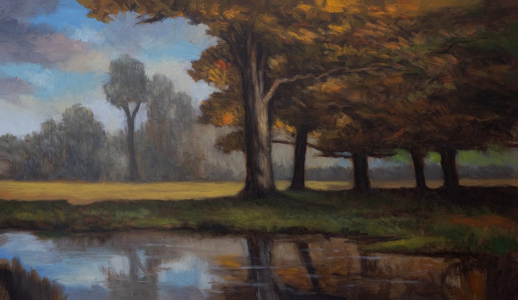
I concocted the reference by messing around with a bunch of stuff until I got something I thought looked good. One of the things I really wanted to change was to have a pond in the front that was reflective, but the essential structure remained very similar to Georges original.
Why Glaze? The Exception to My Rule
It’s not often that I glaze anymore. I used to do it to everything. For many artists that come into my studio, the second word out of their mouth is ‘glazing’ when they look at my work. But I got away from glazing because my work already tends to be a bit darker than a lot of modern tastes move towards already. Glazing will darken paintings even more, as the light has to work its way through that glaze layer.
Normally, I internalize the tonal thing and it informs all my color mixtures. So I don’t need to glaze usually.
But there’s a big exception here because certain effects you can get in the sky are almost impossible to get any other way. If you look at a lot of Inness paintings, the blue of the sky is actually an aqua. That’s a dead giveaway that the painting has been glazed with some sort of yellow. You’re going to see it happen in this painting too.
When the Decision Happened
About two-thirds of the way through that first color pass, it just occurred to me that I was going to have to do a glaze. Then, while it was sitting in the drying rack, I was examining it, in person and on my computer. I was seeing in the upper right tree mass that it was a bit boxy. I set about messing around with my photograph of the painting and trying a few different things to remedy that issue. I think that I did a pretty good job with breaking it up.
I also noticed that where you had two bits of foliage sticking out into the sky area, it felt a little restrained. Two bumps wouldn’t be as good as one I thought. So I changed that as well, along with a few other things.
How to Glaze: The Process
If I’m going to do a second color pass, here’s what I do. I wait for the first color pass to dry quite thoroughly, maybe a week or two. I use a quick drying medium, Archival Oils brand odorless lean to be precise. After it dries, I put a coat of Liquin on the painting. The reason for this is that sometimes things can go very wrong with glazing. If you have that coat of Liquin on there and it is dry, then you’re protected. If you need to, you can then use some spirits and wipe everything off and forget the glazing altogether.
What I was after here was just tinting the sky.
I glazed with a combination of transparent earth yellow from Gamblin and a little bit of Indian yellow. The Indian yellow is super strong, that’s what’s giving it that aqua effect. The transparent earth yellow is really great too. It’s perfect except it’s a little bit green. That warmth that comes in with the little bit of Indian yellow makes the two together the perfect combination. It’s always in my box of paints.
The real giveaway is when you get these aqua tones in the sky. That’s when you can tell an artist has done some glazing.
Water and Reflections
Putting little lines in the water really does add a good effect, but it’s easy to get carried away with it. It definitely gives you that reflective feeling. That’s what you want, a pond to look like a pond.
I made a few small corrections when I loaded the painting back up on the easel. The thing is with reflections is that I’m always trying to improve. I’ve been painting a lot of them lately.
You see that light grass area in the back, I ended up pushing it down a lot farther in the second color pass as well.
The Restraint Factor
The main reason I got away from doing second color or even third and fourth color passes was because I would always overwork things. But I have a lot more restraint now and it’s pretty easy for me to stop myself. So if I need to, I’ll load it back up again like I did this one and I will what needs doing.
This was a real attempt at making an iteration of my favorite tonalist piece by Inness. I’m real happy with it. I actually think it’s quite good.
Take good care of yourself. Stay out of trouble. And fight the power.
Mike’s New Site | Substack | Painting Website | Mailing List | Store | My Music | Support | Members Area
M Francis McCarthy, Your Painter in Residence